Google has never seemed to be fully committed to delivering a top-notch experience in Android Auto, and the always-growing community out there received every single update with much hesitation.
While the lack of excitement in the community has never been a problem, the struggle that some of us had to go through to get Android Auto running again after an update often ruined the entire experience.
As a result, I often delayed the update to the latest version, and I know so many others did the same.
But the recent Android Auto overhaul has a little something for everybody. And this makes it so much better than Apple’s CarPlay, not only from a design perspective, but also as far as usability is concerned. And while I’m still not sure that Google has become more committed to Android Auto than it was before, I like the direction that this project has embraced. And let me detail a little bit on this.
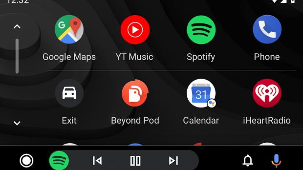
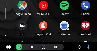
First of all, it’s the thing that everyone notices after updating Android Auto: the new UI with the dynamic bar at the bottom.
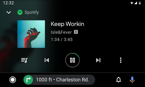
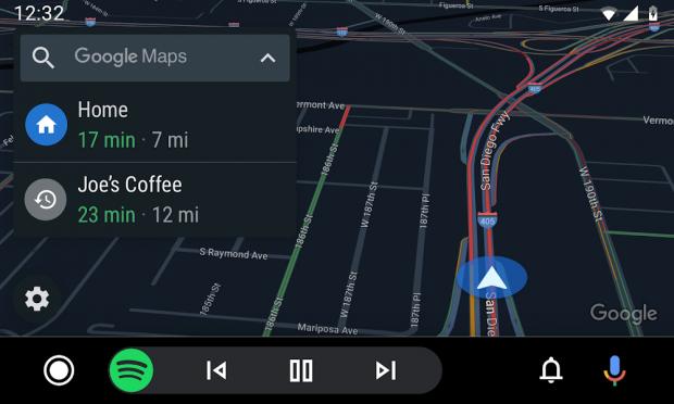
This new navigation bar is actually the one responsible for all the magic, as it can adapt to your running apps and display the essential controls on the screen all the time. For example, if you’re running Google Maps for navigation and Spotify for listening to music, when the maps are on the screen, the navigation bar displays music playback controls. And it works the other way around as well.
While I’m not using Android Auto any differently than before, I still think that it’s now more intuitive and useful, and the persistent controls that you have all the time on the screen are absolutely brilliant.
For navigation apps, the dynamic bar can display navigation instructions as well, so even if you’re browsing Spotify, you know you have to steer left in 200 meters.
There are also the smaller details that improve your general experience with Android Auto. For instance, when using navigation on the screen and someone calls you, the call screen no longer eats up the entire display, so it’s very clear that Google designed the new version in a way that makes everything less intrusive.
The way media apps are handled is once again fine-tuned, and using Spotify is something that has become truly enjoyable. Not only that the app looks very sleek and modern, but it’s now easier to control the playback even without launching Spotify in the first place.
This doesn’t necessarily mean that everything’s working flawlessly, and in Spotify for instance, you still can’t manually search for an artist or song from the car’s screen. This is mostly an attempt to avoid drivers starring at the screen and getting distracted, but this feature could easily be enabled when not in motion.
As far as Google is concerned, the search giant wants to make everything more straightforward by phasing out the Android Auto app for the phone and instead introduce a driving mode in Google Assistant. That wouldn’t change your experience behind the wheel too much, but it shows that Google is very committed to making the Assistant the core of more products.
As compared to Apple’s CarPlay, however, Android Auto feels a much more evolved system for drivers around the world. Apple itself plans to overhaul CarPlay with the release of iOS 13, adding a dashboard with quick access to key information, such as calendar appointments, navigation instructions, and playback controls.
I’ve already tried the new CarPlay in the beta program, and while it’s an evolution of the existing version, it doesn’t help much unless you’re using Apple Maps. This, in my opinion, is a major limitation, as Apple Maps has never been as accurate as Google Maps.
The new CarPlay also makes Siri a first-class citizen of the system, and the whole interface now comes with both light and dark themes that can adapt to the time of day.
All in all, it’s good to see that Apple and Google invest more in their in-car systems, but for the time being, Android Auto just provides a more streamlined approach regardless of your location.
Hopefully, Google will become more committed to refining Android Auto regularly in the long term, as this dramatic overhaul could represent a starting point for a much-needed extension of the Android mobile experience.
 14 DAY TRIAL //