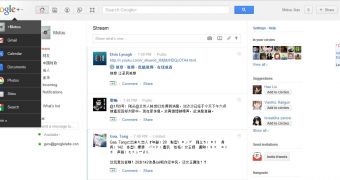
The first screenshots of Google's upcoming navbar redesign have surfaced. Calling it a redesign can be a bit misleading though, the navbar is completely gone, its features and functionality replaced by new features incorporated into the header.
As expected, the list of Google services is now no longer available directly, to reach the most popular ones you have to click on the Google logo on whatever Google service you're currently visiting.
This will bring up a drop-down menu with links to Gmail, Calendar, Documents, Photos and so on. The list of products displayed by default will vary from location to location and from product to product.
However, if you want to see all Google services, there's a More link with a bigger list.
To accommodate the changes, the Google header has been redesigned. The current elements have been moved a little to the left to make way for new ones on the right.
The Google account menu as well as the Settings button are now part of the header. The Google+ share box as well as the notifications counter are part of the header as well.
The first images came from Guao.hk and were surfaced by the Google Operating System blog. You'll notice the interface is in Chinese and that the screenshot is for Google+, but the look and feel should be the same across the board.
That's kind of the point, Google now wants the site header to be almost identical regardless of the Google product you're using, uniformity is the name of the game.
This should create a more cohesive visual identity for Google sites, though it remains to be seen whether the move to a common look and feel works and is a good thing for all sites. So far, the massive Google redesign progress has been going well, but there have been a few snags along the way and there's much more to do.

 14 DAY TRIAL //