14 DAY TRIAL //
 A few months back, around the time Google+ debuted, Google unveiled its brand new, company-wide, redesign. The focus was finally on looks as much as on practicality. Since then, more and more Google sites are adopting the new Google look.
But the company is far from done. Not only will more sites start to use the new design, the design itself is still evolving.
At a conference last week, Google's lead designer for search Jon Wiley, showcased some possible future trends for Google, including the removal of the top navbar from Google Search and other products.
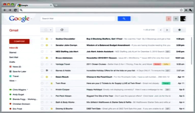
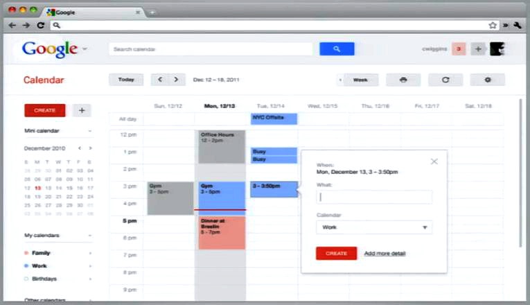
Google Operating System was able to get a hold of some screenshots of the experimental Google design which showcases alternatives to the navbar functionality.
Note though that, since the design is still labeled as experimental and is not even in testing with users yet, there is a strong possibility that it will not be used in Google search and the other sites or that, if it will, some things will be different.
Google regularly tests several design versions when it's ready to make a change and, obviously, only one of those ends up being rolled out to all users.
With that out of the way, here's what Google without the navbar could look like.
The top navbar, which is common across all Google-branded sites, has several main features. On the left, there is a list of Google products and links to them.
On the right, with the advent of Google+, users have Google+ notifications, a 'share on Google+' feature, access to their profile and access to the product settings.
In the navbar-free version of Google, that functionality is replicated elsewhere.
For example, you'll notice that the Google logo in the screenshots has a small arrow next to it, indicating that it could be used as a drop-down menu with a list of Google products to jump to.
To the right of the search box you'll notice your account name, a notifications counter, a share button (the big +) and your profile icon.
The product specific settings have been moved further down in the section below the header, which is currently sitting empty in Google Search, for example.
The separation makes sense. The header will be common and probably identical across products, you'll get a menu to change between Google services, a search box, and the profile and Google+ specific buttons.
Below the header, you'll get a product-specific bar, with the name of the product, Search, Gmail, Docs, etc., as well as buttons related to the product, a refresh email in Gmail, a location button in Search, the sort menu in Docs and so on.