14 DAY TRIAL //
 Google is working on tablet-specific Google Search. It has tested tweaked designs for tablets in the past, now it's back with another one that seems to mold pretty well to touch interfaces, but also integrates some of the future design trends at Google, such as getting rid of the top navbar.
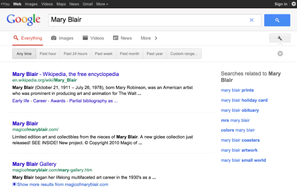
Google Operating System has spotted the redesigned Google Search for tablets. It now lists the individual search engines, Images, Videos and so on, as buttons beneath the header.
Everything, Images, Videos and News are displayed by default, but the rest are behind a More menu button.
There is also a Settings button which links to the search tools, the option to set the SafeSearch level and to restrict results by time and by the various filters Google offers.
The filters and time restriction options are designed for a touch interface as well and are buttons rather than links.
Google has been switching to buttons rather than links for various elements on its sites, partly to better support tablets, partly because they simply look better.
What's interesting is that the tweaks and changes available in the tablet version of the site now in testing could easily be ported to the regular site.
The horizontal search engine selection tool, for example, or the button filters look rather slick.
The only question is how search suggestions work with all of this, Google has tried its best not to have the search suggestion box cover other elements, which most certainly happens on the tablet version.
That said, Google is using the bar below the header to include options and tools across its sites and Search will follow as well, especially since that bar now sits empty and takes up valuable screen real estate but offering little to no functionality in return.