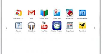
Google Chrome 15 has debuted in the beta channel and, with it, so did the revamped new tab page. The latest incarnation of the new tab page, the fourth if you're keeping track, is the biggest change yet, with a fresh new look and a new way of displaying the various sections.
That said, while the latest new tab page is the best looking to date, it's not a step forward in terms of functionality.
Doing anything typically implies several more steps than it did before and the new tab page ends up wasting time rather than saving it.
"We’ve redesigned the page to simplify the visual appearance and make it easier to manage your apps, bookmarks, and most visited sites, so you can get where you’re going as quickly as possible," Evan Stade, software engineer at Google, wrote.
"Your apps, bookmarks, and most visited sites now appear in three different sections on the page. You can flip between these different sections by clicking the section labels at the bottom of the page or the arrows at the side of the page," he explained.
If you only use one section, i.e. you use a lot of apps but not bookmarks, the new layout works and it certainly looks better, so it's good update.
If you do use more than one section, you'll find yourself spending a lot more time in the new tab page than you'd want.
This would all be fine, if everything worked as it should. At this point though, even if the new tab page has made it to the beta channel, the feature still has some glaring design flaws.
The big ones that have been plaguing dev channel users have been fixed, but there are still things that don't work, or work poorly.
An example is the Bookmarks section. When it was introduced, it was almost impossible to navigate the bookmark folders because the big arrow button that pointed to the Apps section covered the link to the top bookmark folder.
This was fixed soon enough, but navigation is still a pain. In the latest update, the breadcrumb navigation that would enable you to move about your bookmark folders is broken because the breadcrumbs are no longer links, they're just plain text.
Click on them and they do nothing, leaving you unable to go back to a previous folder. Unless, that is, you accidentally click below the breadcrumbs, but not above them or on the sides, which will lead you to the folder you chose.
There is absolutely no indication that the area below the text is a button. There's no logic for it to be limited to only that area either.
It may seem like a minor bug, but usability issues like this are the type of things that frustrate users and make them switch to another browser. Speaking of which, Firefox is beginning to look and move a lot better these days.
Google Chrome for Windows is available for download here. Google Chrome for Linux is available for download here. Google Chrome for Mac is available for download here.

 14 DAY TRIAL //