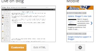
A while back, Blogger started thinking about people visiting blogs on their phones and introduced mobile templates about a year ago. It made them available to all last summer and has added a few more abilities aimed at these readers in the meantime.
Now it's making another big step by enabling bloggers to customize the look and feel of the mobile versions of their blogs. It's a great option for anyone wanting to maintain a unified design on all devices.
"Many Bloggers put a lot of time and effort into creating a unique look for their blog, so today we’re excited to announce that custom templates are now available for mobile devices," Blogger's Brett Morgan wrote.
"If you have a custom template for your blog and want it to appear on mobile browsers as well, visit the 'Template' tab of your dashboard, click on the gear icon beneath the mobile template preview, and select 'Custom' from the 'Choose mobile template' pulldown," he said.
However, you have to make sure that your handwritten template works on mobile devices, more often than not, it will look weird, unless you've made specific changes to deal with the smaller screens, or you've planned ahead and created a more dynamic template.
In any case, you can now specify that you want certain elements to look different on mobile devices, so the same template can work for both desktop and mobile use.
There are several ways of doing this, on the one hand, you can check for mobile use and only display certain elements if that is the case. You can also use the 'mobile' class for any CSS element to specify that the attributes should be used for mobile devices.
There are ways of enabling and disabling any blog gadget as well, for mobile use. The Blogger Developers Network blog has the more technical details if you're interested.

 14 DAY TRIAL //