File Explorer has been around for a while and new Windows versions brought only subtle improvements, even though features like tab support and an improved UI are among the top voted requests from users.
More recently, however, Microsoft has started work on a touch-optimized version of File Explorer, which is very likely to see daylight officially with the release of Redstone 3 in September.
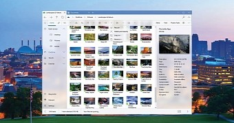
In the meantime, more and more mockups reach the web to provide us with a preview of what the file manager could actually look like if Microsoft were to go for a fully modern design. And this is the case of this concept posted on Behance by Michael Crabtree.
Project NEON
The first thing you’ll notice in this concept is that it uses a Project NEON-like appearance, with blur and transparency that bring it in line with the visual makeover that Microsoft is preparing for Redstone 3.
There are also touch optimized menus, plus a top tab bar inspired from Microsoft Edge, the new browser that comes as default in Windows 10. This makes it possible to work with multiple folders at the same time, without having to launch more than an instance of the same app.
You can have a glimpse into how a file manager like this could work in Windows 10 in the GIF below, but there’s just a little chance to see this design embraced for Redstone 3. On the other hand, the touch-optimized File Explorer is still in its early days, so there’s plenty of time for a dramatic overhaul if Microsoft really wants to make it available to users.
Redstone 3 is projected to launch in September, but preview builds are already available, with an early version of the application implemented in the OS. Microsoft is likely to continue work on the app in the next builds, so more news in this regard should be provided as the Insider program advances towards the final builds of Redstone 3.

 14 DAY TRIAL //