14 DAY TRIAL //
 The Windows 10 Start menu hasn’t evolved much in the last few versions of the operating system, but smaller refinements have anyway made their way to OS feature updates.
Windows 10 19H1 due in the spring follows the same trend, and while it does receive its own share of improvements, it’s still far from the modern experience many users expect.
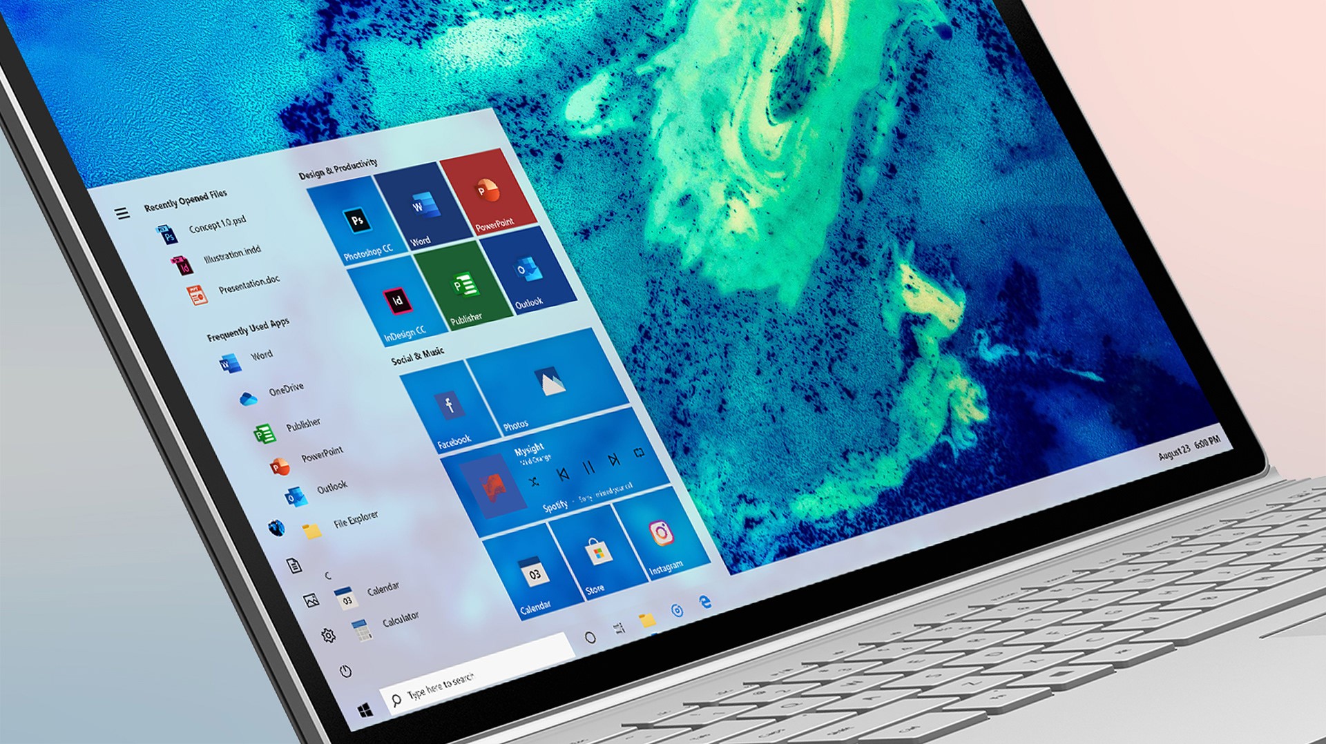
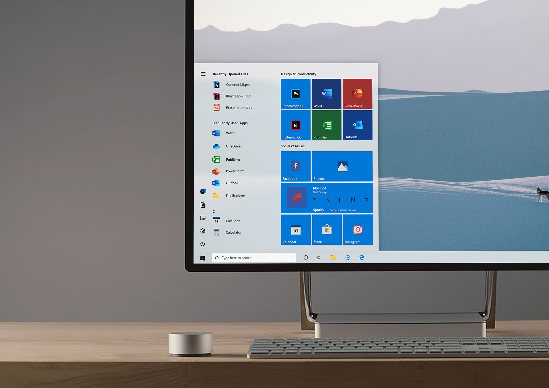
A concept published recently on Behance by user Cage Ata envisions such a revamped Start menu, which also includes the modern Office icons that Microsoft announced in late 2018.
As you can see for yourselves by browsing the gallery here, the concept comes with subtle shadows, a refined font, and increased depth for several elements.
The Start menu also aligns with the light theme that will be available in Windows 10 19H1 and which is already available for testing for users who are part of the Windows Insider program.
Windows 10 19H1
Customizations like this one have always gained many fans across the world, mostly because they make the operating system as a whole look and feel fresh.
Microsoft itself, on the other hand, has been rather slow in terms of embracing visual updates for Windows 10, though as long-time Windows users already know, several improvements in this regard have indeed been rolled out.
For example, Windows 10 now has a dark theme, and developers are encouraged to roll out updates for their applications in order to align the user interface with this black mode and thus offer a consistent experience across the entire operating system.
Windows 10 19H1 will be finalized in March this year, with insiders to be the first to receive the RTM build as always. The rollout of Windows 10 19H1 to production devices will kick off in April and will happen in waves just like the October update.