Microsoft’s Fluent Design language has already brought a highly-anticipated visual overhaul to Windows 10, but this doesn’t necessarily mean that users don’t expect the company to go even further with its OS facelift.
And as a matter of fact, the Fluent Design rollout continues in Windows 10 (and in other products too), with Microsoft gradually redesigning certain parts or apps for the OS.
In the meantime, designers in the Windows community are working on their own concepts which help envision how certain redesigns would look like once the Fluent Design makeover is complete.
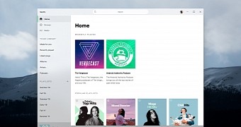
What we have here is a concept that imagines a Windows 10-optimized version of Spotify, and of course, Fluent Design is an essential part of the design.
In fact, the Fluent Design language looks so good in this concept that makes the Spotify overall look like a macOS app. Not that it’s a bad thing, as the Mac has often been praised for its eye-candy looks.
The Fluent Design push
The redesign, which was created by Zee-Al-Eid Ahmad Rana, who has previously created so many other Windows 10 concepts as well, could actually align with the facelift that Microsoft itself is pushing in the operating system.
But of course, it’s up to Spotify to build such a design for its app, if it ever decides that Windows 10 is worth the effort in the first place.
For the time being, one thing is certain: the Fluent Design language rollout continues in Windows 10, mostly at a pace that slower than many people expected, but we should get more visual updates rather sooner than later.
Microsoft has recently released a significant icon update for Windows 10, so there’s a chance more such tweaks are on their way to computers across the world.

 14 DAY TRIAL //