14 DAY TRIAL //
 Dark themes have become surprisingly popular these days, and the majority of software developers are in the process of or have already launched them for their apps.
As two of the largest software developing companies on the market, Microsoft and Apple are also investing in dark themes for their products, and even though you’d expect them to be pioneers in this regard, they somehow need quite a lot of time to release such updates.
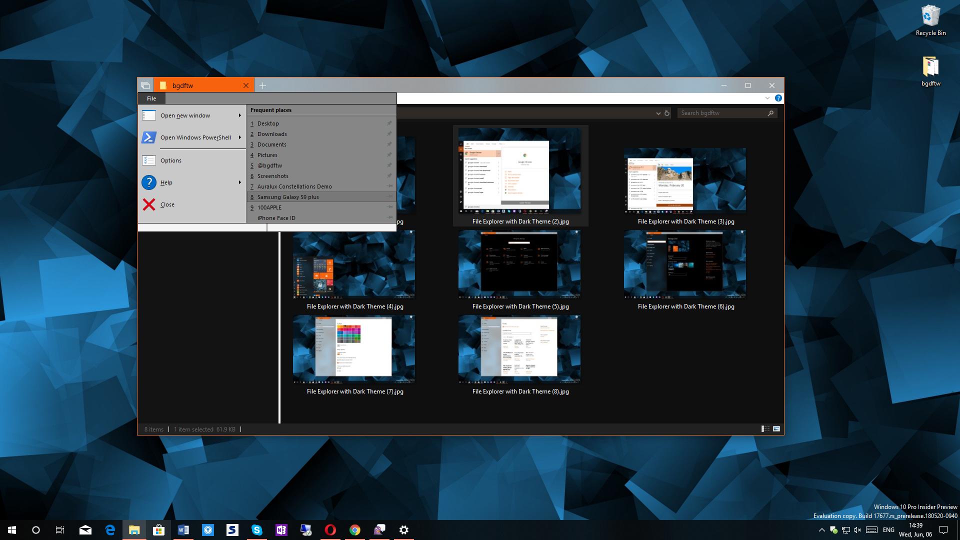
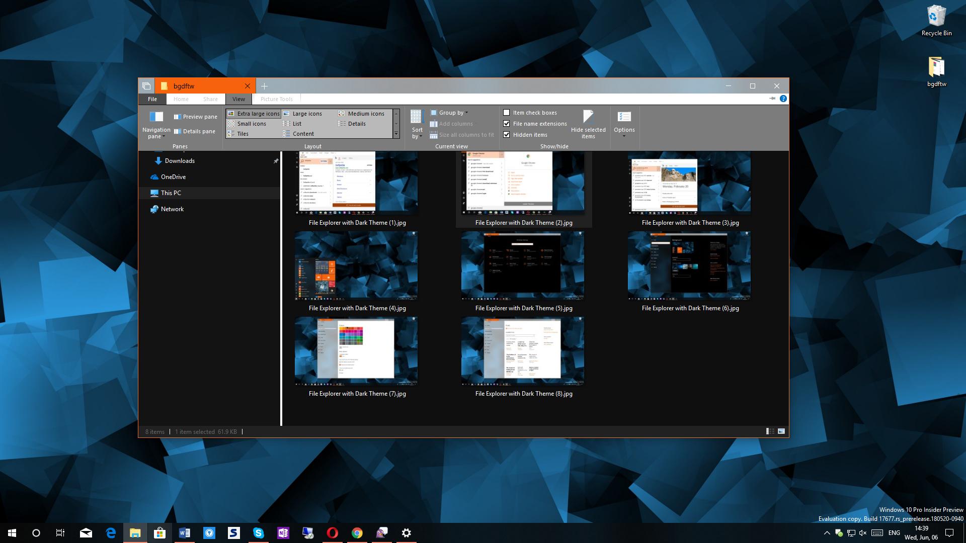
Microsoft itself has launched dark visual styles for a number of pre-installed Windows 10 core apps, but when it comes to its file manager, this feature is still in the works. A dark mode in File Explorer is among the top feature requests, and while Microsoft is fully aware of this, the project still seems to advance at a surprisingly slow pace.
File Explorer with a dark theme is projected to go live for everyone with the Redstone 5 update for Windows 10 in the fall of this year.

Apple also seems to have a dark theme problem, and although it’s been around for quite a while on the Apple Watch, the company showed no interest in bringing this visual style to the iPhone or macOS.
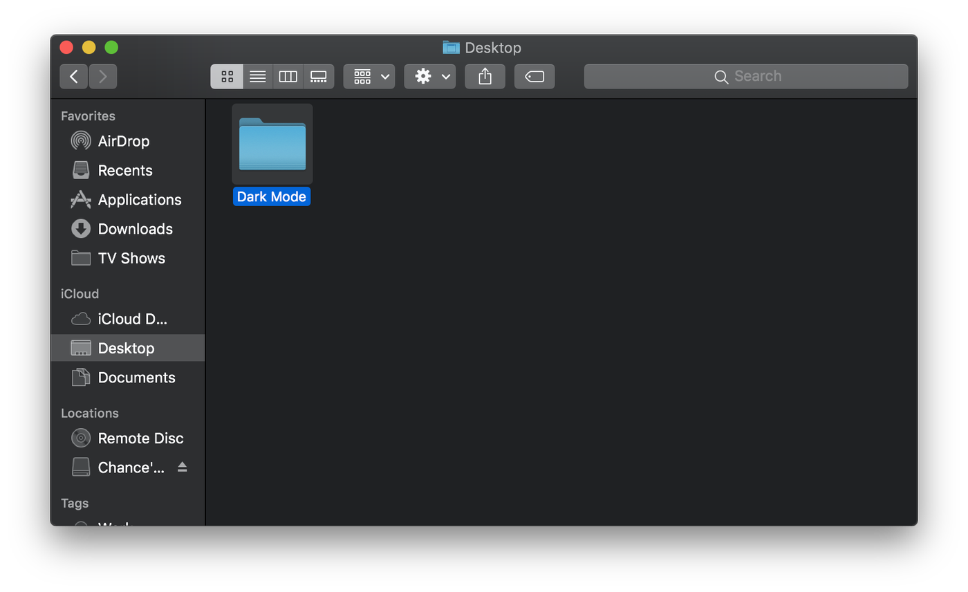
And yet, at the WWDC conference this week, Apple finally announced that the next version of its desktop operating system, codenamed Mojave, would bring a dark theme across the OS.
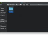
As you can see in the screenshots below, this dark look will also be available in Finder, which is more or less Apple’s own file manager and rival to File Explorer.
Just like it’s the case of Redstone 5, Mojave is still work in progress, and the update should become available to everyone later this year.

Which one looks better?
Without a doubt, deciding which one of the two looks better is all a subjective choice, though I think that everyone agrees that Microsoft’s File Explorer still needs many, many refinements.
And this does make sense. File Explorer’s dark theme is still in its early days in Windows 10 insider builds, but there are things that you wouldn’t normally expect from a company the size of Microsoft, such as the grey parts in the ribbon.
Microsoft promised to improve the experience with File Explorer’s dark theme in the coming updates, so hopefully, the interface would be more consistent and blend nicely in the rest of the operating system.
In its turn, Apple’s dark theme seems to be a lot more refined, without any visual glitches as it happened in the case of Microsoft. Everything seems more inviting than in File Explorer, and truth be told, it looks like Apple itself has spent considerably more time than Microsoft on this project.
Apple has always been praised for its approach on design, but Microsoft doesn’t disappoint either. The Redmond-based software giant is currently in the process of overhauling Windows 10 with Fluent Design, a new design language that comes with effects such as acrylic across apps and the OS.


By the looks of things, Microsoft does seem to have a few things to learn from Apple in terms of design, but on the good side, it doesn’t all come down to the way apps look in an operating system. Usability is one of the key features of each app and operating system, though in many cases, a good-looking interface has a major contribution in this regard.
Time will tell if Microsoft has what it takes to polish the dark theme of File Explorer in a substantial manner, but for the time being, Apple just seems to be the leader in terms of visual improvements across its desktop platform.