14 DAY TRIAL //
 Windows 10 is an operating system that’s constantly evolving, but many envision an even more dramatic visual overhaul in the long term, with some ideas pushing it really close to Apple’s design language that’s currently used in macOS.
Truth be told, Microsoft’s Fluent Design language, which is still being rolled out gradually, gives Windows 10 a much anticipated facelift, and the more refinements the software giant ships to production builds of the operating system, the more polished the experience feels from one end to another.
As we know already, everything has to be dark in the software world these days, no matter if we’re talking about mobile or desktop, and pretty much every respected developer out there has created a black theme for their apps. Microsoft itself has previously updated Windows 10 with a dark mode, as well as with a similar visual style for all of its apps for more consistency in the operating system.
And truth be told, the dark theme in Windows 10 not only that looks good, but is also very helpful especially when working late in the evening or during the night. And that’s exactly its purpose.
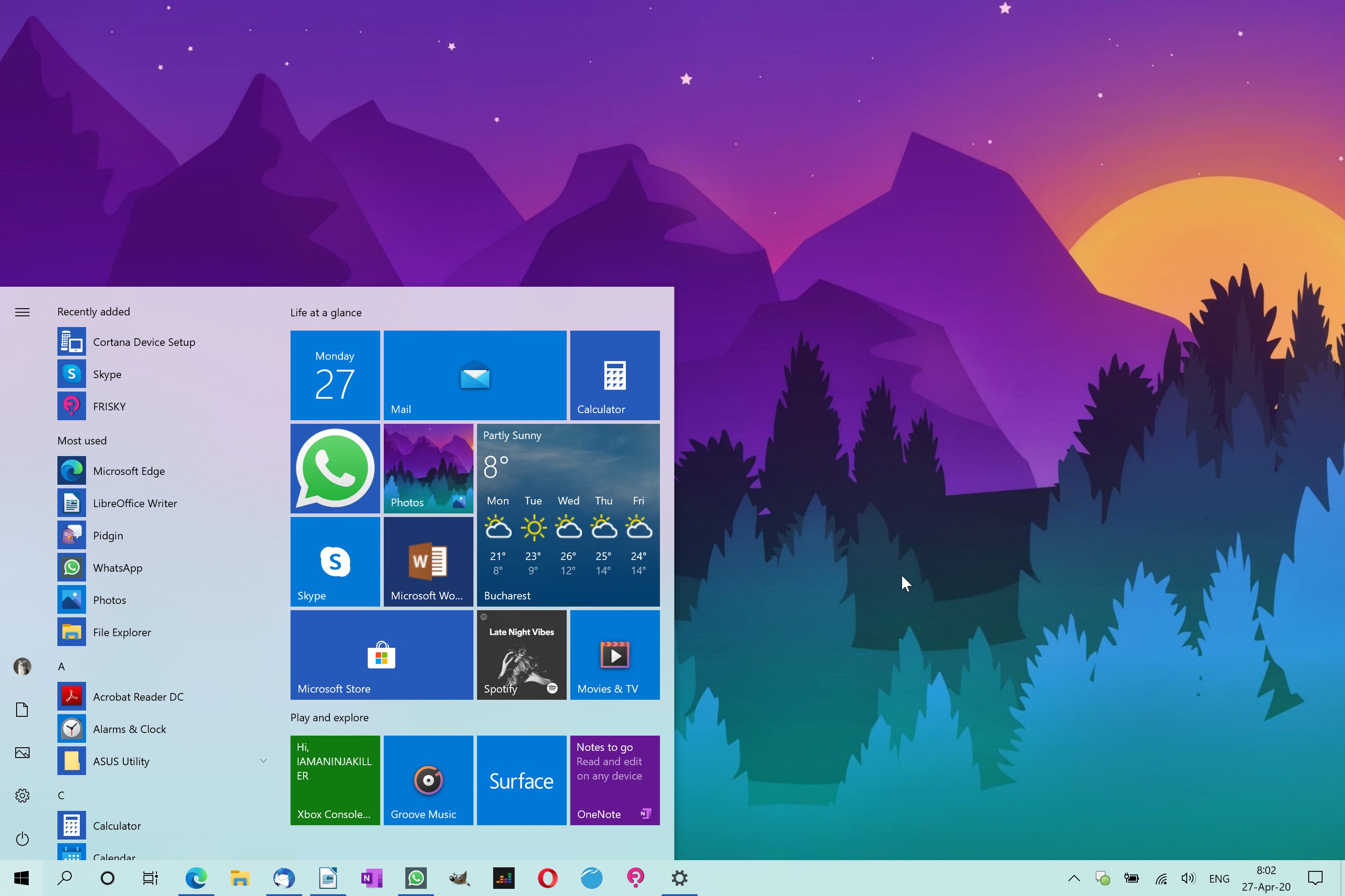
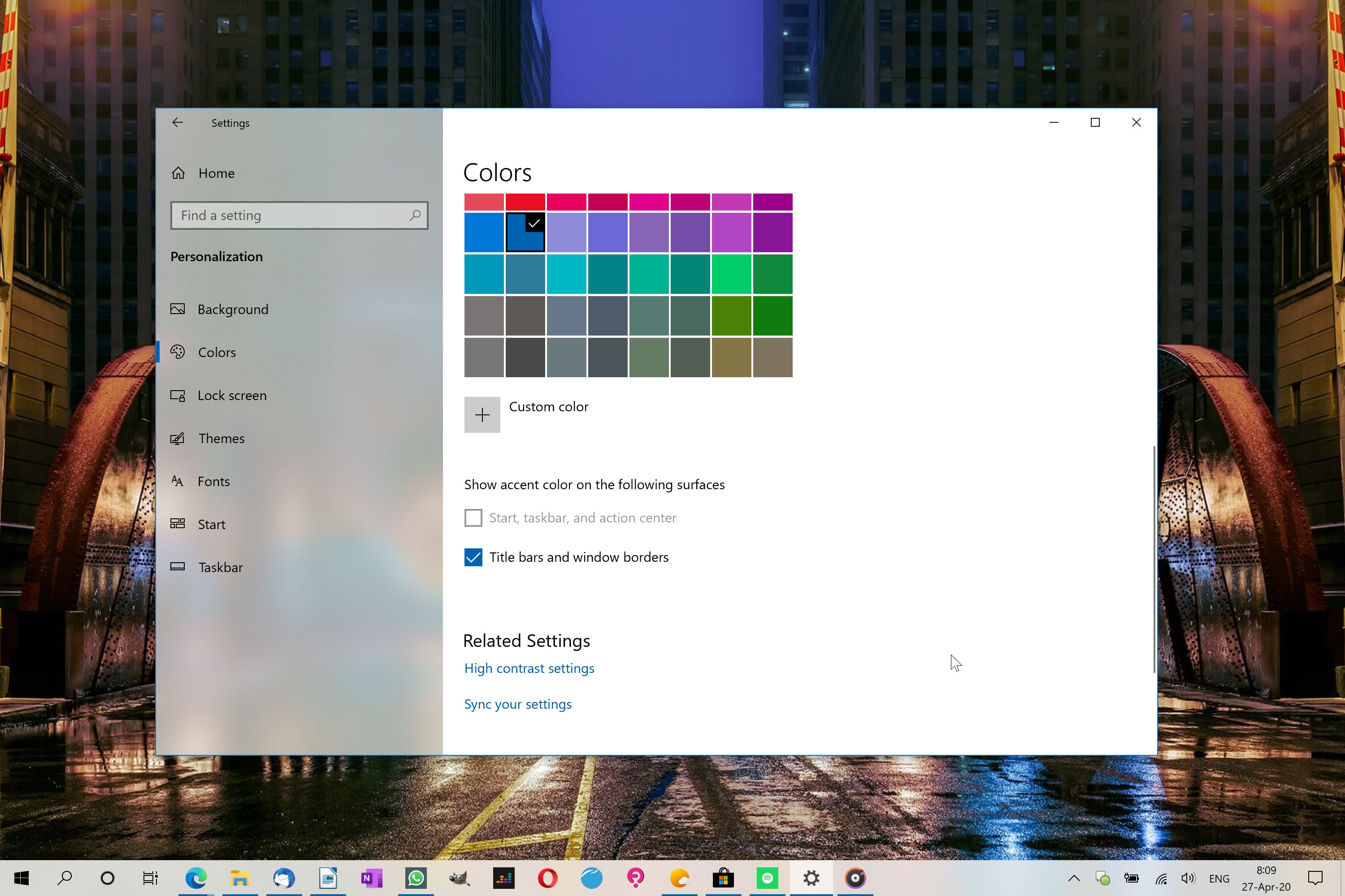
But in the May 2019 Update, also known as version 1903, Microsoft also introduced a new light theme that so many people seem to love. And now in Windows 10 version 2004, which is scheduled to go live for production devices in just a few weeks, the experience with this light theme feels a lot more polished overall.

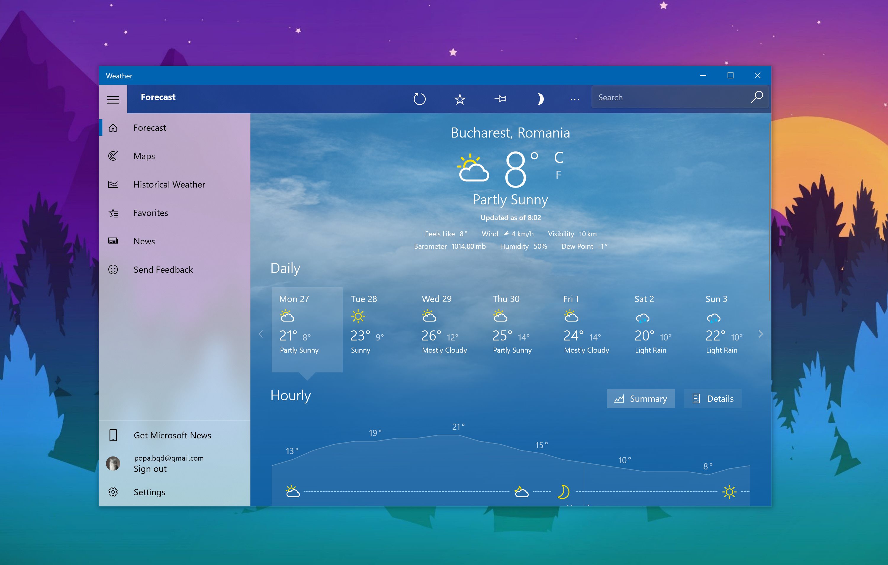
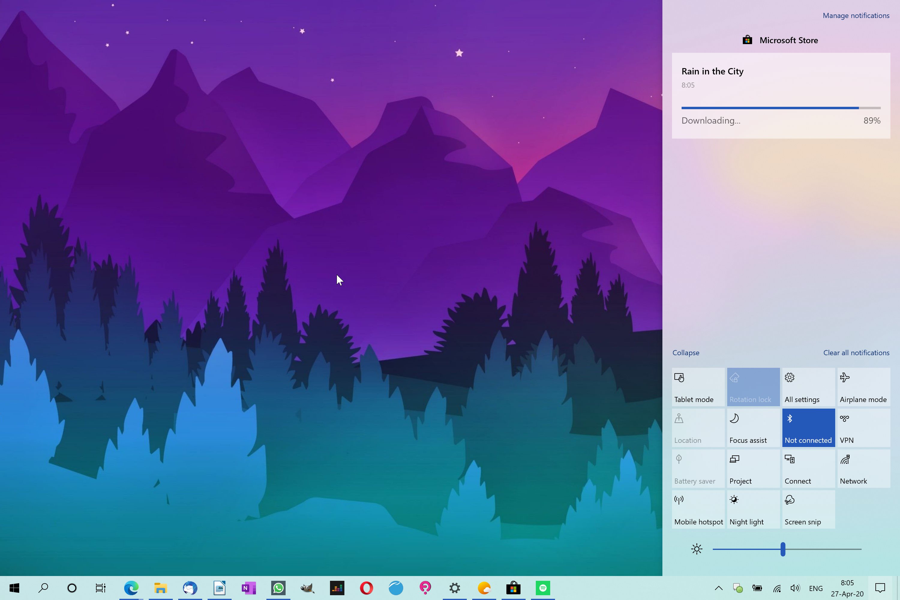
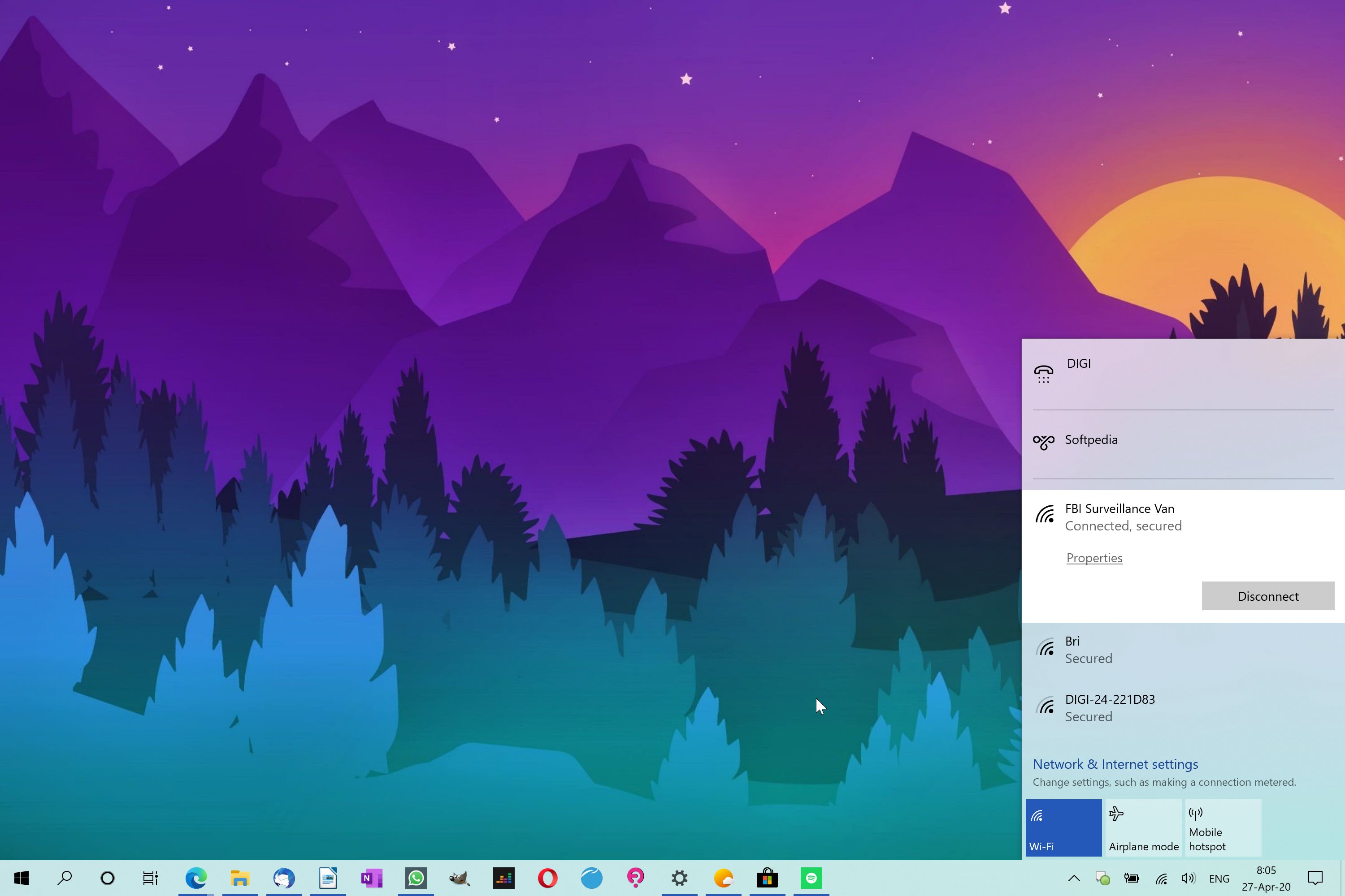
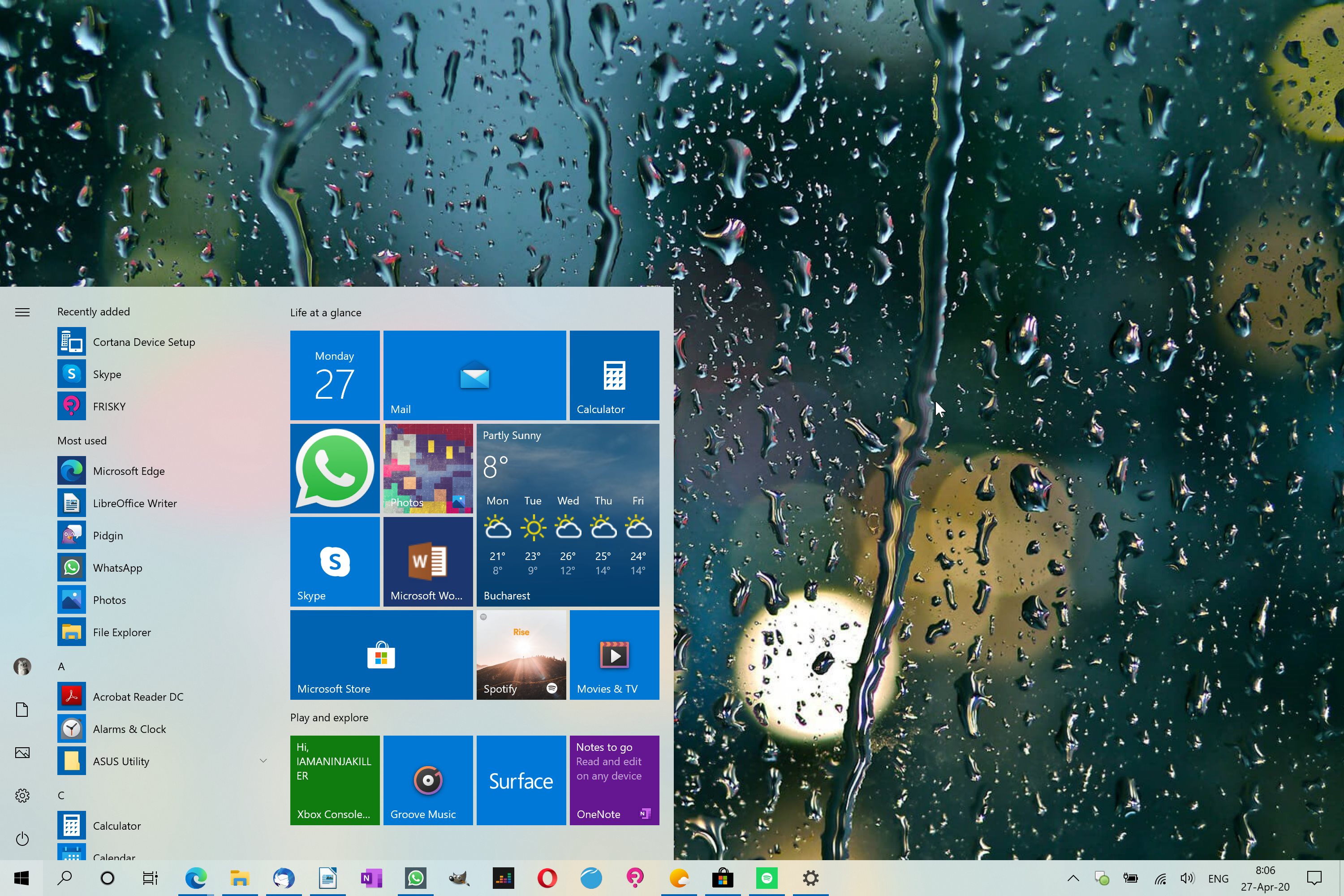
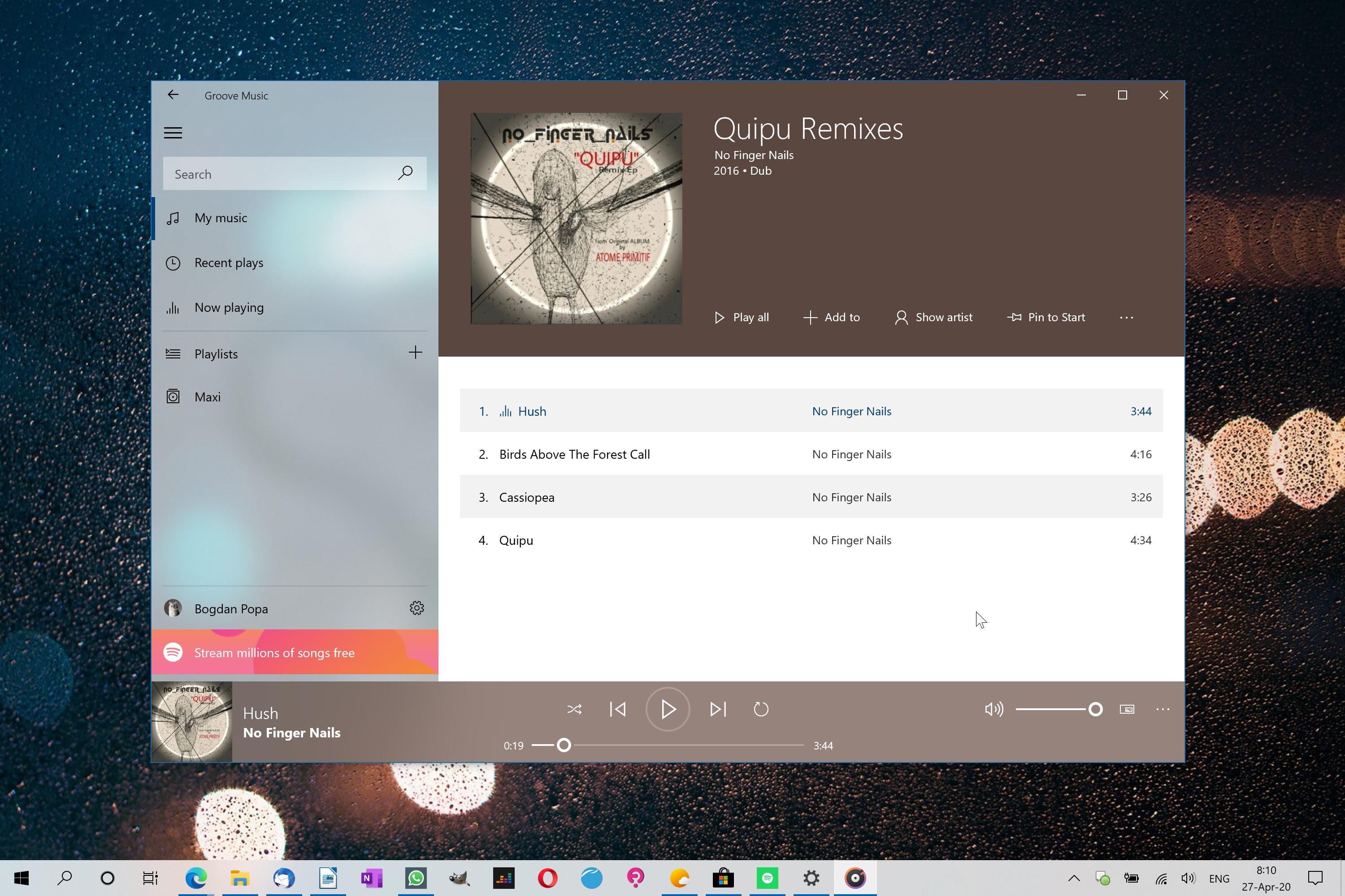
The screenshots that you see here show a quick setup based on this light theme, all using nothing more than the settings Microsoft offers to users in Windows 10, some of which are enabled by default. The transparency effects, paired with other visual gimmicks like the accent colors and the new icons, make Windows 10’s light theme the modern overhaul that so many have been hoping for.
At first glance, the light theme really doesn’t seem like a good choice for the late-evening work hours that I told you about earlier, but with Night light enabled (the blue light filter that Microsoft bundled with Windows 10), this really isn’t a problem anymore.
The new icons that Microsoft has recently released for Windows 10 are also an important part of this modern feeling offered by the light theme, there’s no doubt about it.
But the work on the facelift must continue, and I think the next step should be the Start menu. In my opinions, the current implementation of live tiles don’t make much sense, especially as they look outdated and sometime eat too much space in the Start menu without an actually useful purpose.

Concepts that have been swirling around the web in the last months envisioned a completely overhauled design for the live tiles, including a modern look mixed with new features that would allow perform certain things without launching the apps themselves.
Meanwhile, it’s believed that Microsoft is pondering the completely removal of live tiles due to reduced usage, and indeed, this could be the correct way to go for a more simplified Start menu. No matter which choices the company makes, it’s important to maintain this push for a more refined look, as this is exactly what users seem to love these days.
Windows 10X is living proof Microsoft is going in the right direction, and now everybody expects the company to bring similar ideas to full Windows 10 as well. If this happens, Windows 10 can finally become the operating system users have been drooling after for so many years.