Apple is known as a company that seeks perfection in the smallest details, but as a bunch of designers discovered the hard way earlier this week, not even the Cupertino-based firm can get everything right.
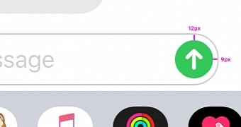
A Vietnamese designer called Anh took to Twitter to reveal something that some described as “disturbing” and which everyone has a hard time unseeing right now: a slightly misaligned send message button on the iPhone that Apple for some reason totally messed up.
Basically, what Ahn came across is a 25 percent difference in the way the send message button is aligned in the box, creating a discrepancy that’s not necessarily easy to notice when zoomed out, but which might be triggering some people’s OCDs after zooming in.
Apple obviously tight-lipped, albeit a fix is very likely
At first, this might not seem much, especially because it’s almost impossible to spot the difference in day-to-day use, but as some other Twitter users replied, this isn’t necessarily the only design mishap in iOS. Some other icons and UI controls designed by Apple come with similar questionable choices, leaving many wonder if the iPhone maker turned to first-graders to design the interface.
At some level, this is without a doubt amusing, especially if you check out the other designers’ replies on Twitter, but on the other hand, it seems to suggest that Apple might no longer be the company that was obsessed to refine every little detail in its products.
It goes without saying that Apple hasn’t said a single word about this whole thing, but I personally wouldn’t be surprised to see the company silently fixing this in a future update. Given the pace at which Apple rolls out iOS updates these days, it really shouldn’t take too long before this happens.
Have a great Tuesday everyone! pic.twitter.com/C6nu6TIwng — Anh (@pwign) October 15, 2019
pic.twitter.com/Y8dm7ODZ0L — Matthieu Souteyrand (@Nazermatt) October 15, 2019
pic.twitter.com/kzoQF8wUb2 — Amine Hannan (@aminehannan) October 15, 2019
pic.twitter.com/wmKLjDB6Sv — Jack O'Lantern Gannon 🎃 (@jackgannon_) October 15, 2019
I just cannot stop looking at it now... — Josh MacDonald (@ShapesByJosh) October 15, 2019
This unmade my day :( — Aycan Doganlar 🦄 (@pinquitte) October 15, 2019
Please remove this disturbing content from my timeline — Ian McDowell (@ian_mcdowell) October 16, 2019

 14 DAY TRIAL //