As part of Microsoft’s transformation that brings a major overhaul in terms of features, design, and usability for all its products, the company is also replacing fonts used by its top software products, including Windows and Office, so everything looks a bit more modern and fresh on the desktop.
But there’s no doubt that long-time Windows users are very familiar with some of the technologies that were previously available in Microsoft’s software, including games (such as the number-one time-wasting weapon Solitaire), apps, wallpapers (oh, Bliss, we miss you so much!), and even fonts.
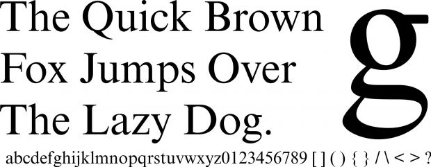
Today, we’re going to talk exclusively about fonts and look back at what’s probably one of the most, if not the most, popular fonts in the operating system: Times New Roman.
Everyone heard about it and almost everyone used it, so Times New Roman isn’t quite a new thing for Windows users. It’s still there in Windows 10, but it’s less used than before, pretty much because new and modern fonts are also available in the operating system and the other software solutions.
Together with Comic Sans and Arial, Times New Roman has been used for the creation of billions of documents, but as compared to the other two, it served as a way to write a more professional-looking document that was supposed to be printed.
How it came to be
The history of Times New Roman is as interesting as it is controversial.
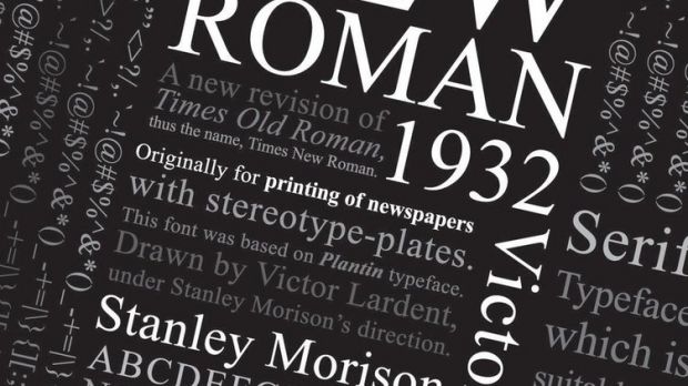
Most documents claim that Times New Roman was created by The Times British newspaper, which commissioned typographer Stanley Morison of Monotype to build its new font in 1929. Morison created the new text font for The Times (hence its name), but it was then licensed to Linotype because the newspaper was using their typesetting machines.
Basically, Monotype created a font for Linotype, and you’ll understand why this was so important in just a few paragraphs.
As mentioned, while most documents suggest that the font was created in 1929 for The Times, there’s evidence claiming that Times New Roman is actually the creation of William Starling Burgess, a wooden boat designer based in Boston.
“Times Roman was created in 1929 by Stanley Morison and was based on Plantin typeface. It was designed for printed newspapers.”
It appears that Burgess designed the font in 1904 for his own firm’s documents and worked together with Lanston Monotype, the owner of Monotype at that time, on the project. Burgess, however, dropped the idea, so the project was canceled until 1929, when The Times contacted Monotype for a similar font.
This side of the story was revealed in 1987, when Gerald Giampa, the owner of a Canadian printing company, purchased Lanston Monotype and discovered the first plans of the project created in early 1900s.
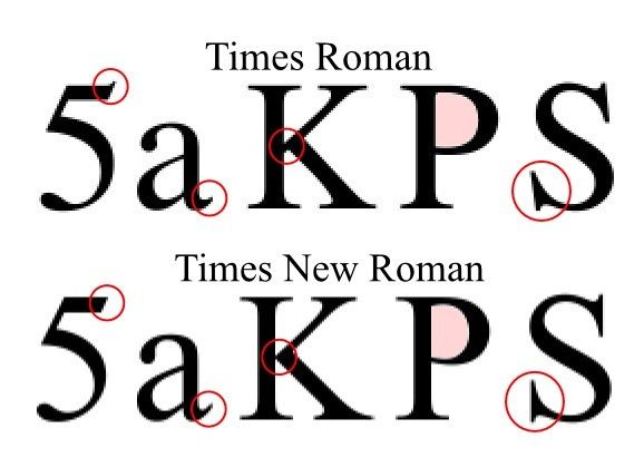
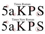
Now getting back to the Monotype versus Linotype case, there’s one thing that’s key to the rest of the story: because of the rivalry between the two, Monotype decided to use the font on its own under the name of Times New Roman, whereas Linotype and the Times had their own version of the font called Times Roman.
How Microsoft ended up using Times New Roman
As you can easily figure out by simply reading the paragraph above, Microsoft uses Monotype’s version of the font, so the Redmond-based tech giant is one of the licensees working with the actual creator of the font.
But Microsoft’s version is not 100 percent the creation of Monotype because it also uses some changes, such as lighter capitals, which were specifically designed to better fit documents written in German and supposed to be printed.
Microsoft is one of the companies that brought Times New Roman in their products, so pretty much every single version of Windows comes with it. Windows 3.1 was the first version that got it and the same font is still there in Windows 10, although it’s no longer default.
The same goes for the Office productivity suite. Every version of Office until 2007 came with Times New Roman as the default font, but newer versions of the software solution switched to Calibri, a new font that Microsoft is using ever since it introduced the DOCX format.
In case you’re wondering why Microsoft decided to switch from Times New Roman to Calibri, the answer is the same as the one mentioned in the introduction of the article: the company was heading towards a more modern and fresh look for its documents, and Times New Roman’s look was considered outdated.
Times New Roman was designed to be used on newspapers, so it was a little bit narrow to allow more text to be used on the same page. This is no longer a requirement for modern documents where readability is mandatory, so Calibri better tackles the modern world.
Joe Friend, Senior Program Manager at Microsoft, explains the reason for giving up on Times New Roman:
“At the time, Office was looking to modernize the look and feel of documents created by the Office applications. They hadn’t changed substantially since the early 90s. Among many other improvements, the introduction of the new fonts had a big impact on the modern look. The use of san serif Calibri as our default body font (instead of the old standard Times New Roman) was one of the more controversial changes.”
As a conclusion, there was a time when Times New Roman was pretty much the main option for companies that wanted to adopt a more professional approach for their products, and Microsoft just had to ride the wave. Times have changed since then and Times New Roman is no longer number one, despite the fact that it’s still being used by millions of people worldwide.
 14 DAY TRIAL //