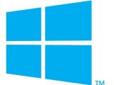
How many of you would say “I like it” if I asked you “what you think of the new Windows 8 logo”? Based on the comments received for the previous article on the matter, I would say only a few. However, it appears that things might have been different, and that there could have been more people saying “yes” to the new logo.
The design team over at Pentagram, in charge with coming up with the new Windows logo, imagined it differently. Not different by much, but different enough to appeal.
Additionally, they offer some details on why they made the design choices they did. It all makes perfect sense when seeing things from their perspective.
According to them, the new logo was meant to reflect the sleek, modern “Metro” design language that Microsoft introduced along with the first Windows Phone 7 devices.
Based on the design principles of the Swiss International Style, the Metro UI includes clean lines, shapes and typography and bold, flat colors. They saw the new Windows identity as suggesting dimensionality through using the classic principle of perspective.
“The perspective drawing is based on classical perspective drawing, not computerized perspective. The cross bar stays the same size no matter the height of the logo, which means it has to be redrawn for each time it increases in size, like classic typography,” they explain.
Thus, the new Windows 8 logo was meant to look just as in the first image attached to this article. Microsoft, instead, chose to modify it. The logo they presented to the world, and which drew a negative response, can be seen in the first image below.
“The perspective analogy is apt because the whole point of Microsoft products is that they are tools for someone to achieve their goals from their own perspective. The window here is a neutral tool for a user to achieve whatever they can, based on their own initiative,” the design team explains.
They also say that the logo design was deliberately thought neutral to serve a multitude of uses, especially motion. It can convey actual motion, thus becoming more active.
As Long Zheng notes in a recent post, Microsoft might reconsider its position towards the new Windows 8 logo, though it is not likely that we’ll see major changes announced in the near future.
I must admit that I do find the idea behind this new logo more appealing than the actual Windows 8 logo that Microsoft made official only a few days ago. But then again, I don’t know that much about design, so please let me know what you think of it in the comments section below.

 14 DAY TRIAL //


