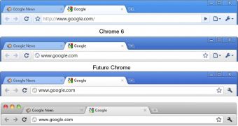
Changes in Google Chrome are harder to notice simply because they happen so often and are usually very small. Going from one version to another, it’s hard to see any difference, but that doesn’t mean they’re not there. In fact, the Chrome UI has been getting a lot of attention lately with plenty of small tweaks meant to streamline the experience and make the browser even less cluttered.
“As part of our continual work on Google Chrome’s user interface, we’ve been trying to streamline the toolbar, make the Omnibox more approachable, and communicate site security information more clearly. Users on our dev channel may have noticed some of these experiments already,” Nicholas Jitkoff, User Experience Designer at Google Chrome, wrote. “In all these cases, we may tweak or even revert experiments before settling on a final solution.”
The Omnibox, arguably the most important, or at least the most visible, element of the user interface has gotten a few updates. Because the Omnibox is part address bar part search box, there are visual cues to know how Chrome will interpret what you’re typing. When doing a query a magnifying glass icon will show up and when typing an URL, a globe.
Visiting a secure site is also easier to notice as there is now a lock icon at the start of the URL. The icon as well as the leading ‘https’ are green to make them stand out. Another update introduced a while back was the removal of ‘http://’ from regular addresses to make them easier to read.
More recently, the star icon, which enabled users to bookmark a web page, was moved to the right and incorporated into the Omnibox. At the same time the Go button was removed altogether and the Stop and Reload buttons have been merged. This saves up a bit of space and groups related actions.
More changes are coming and they’re going to be pretty significant. One that has been discussed and tested recently, though it hasn’t made it into the dev channel releases yet, is the merger of the Page and Wrench menus. The structure of the merged menu is still being finalized, but the move should simplify the Chrome UI even more.

 14 DAY TRIAL //