We have already published our Samsung Galaxy S5 review, but for those who want a more in-depth look at how the South Korean company came to design the smartphone’s new UI, here are some interesting details that the handset maker has just shared publicly.
It appears that Samsung’s engineers who worked on the new UX for Galaxy S5 included in the user interface only those colors that would look amazing on the smartphone’s full HD Super AMOLED display.
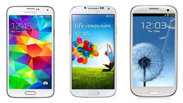
Unlike the previous Galaxy S devices, which used sounds and images of nature, the S5 is the first that makes use of “colorful abstractive geometrical pattern” for the UX visual.
As mentioned earlier, Samsung has also confirmed that “in terms of color, the design team wanted to make the Galaxy S5 stand out among its competitors. They had to choose colors that could only be presented well in the FHD Super AMOLED display. After numerous tests, they finally selected several colors, including different shades of blue.”
But this is not all. Samsung’s engineers claim to have included in the UX a unique touch feature “that pumped bubbles in the extracted color the user pressed on the main lock screen.”
Basically, this means that when a user presses on the orange colors on the main lock screen, orange bubbles will appear immediately on the main UX visual. The new feature is intended to offer a unique experience to Galaxy S5 owners.
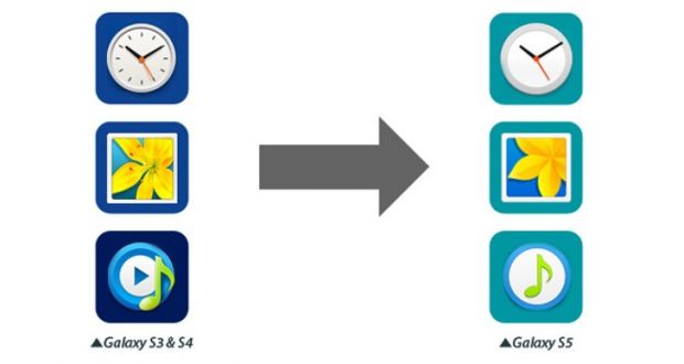
Further into the icons category, there’s no secret that Samsung turned to the flat-style design. The icons in the Galaxy S5 have been redesigned to reflect the new simpler and cleaner approach.
Samsung also offers an example of how these icons have been redesigned: “the 12 short lines in the clock icon have disappeared, leaving just the hour hand, minute hand, and second hand. In case of the Gallery icon, the seeds in the yellow flower have been removed.”The back cover is another aspect detailed by Samsung’s team of designers. The Galaxy S5 is the first that gets an improvement in comparison with previous models.
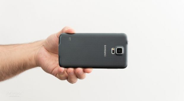
The South Korean company has confirmed that its designers focused on enhancing the grip on the phone, hence the perforated pattern on the battery cover.
The material that got into the final version of Samsung Galaxy S5 is said to imitate sheepskin leather, which apparently has “the softest touch and a comfortable grip.”Samsung tested hundreds of fabrics before making this choice, including plastic, wood, textiles and glass, but it looks like the sheepskin leather was the closest to its vision.

 14 DAY TRIAL //


