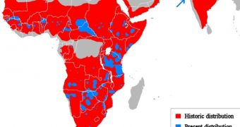
Conservationists keep telling us that lions might fall off the biodiversity map sometime in the not so distant future if efforts are not made to keep this from happening.
Still, something tells me that no report released by greenheads could ever have the same effect as the picture available above.
The map documents both the land that lions used to inhabit not very long ago, and the areas that these felines are known to currently inhabit.
In case you haven't figured it out yet, the historic distribution of lions is the one in red. The color blue, on the other hand, marks the present distribution of this species.
According to Tree Hugger, the world was home to about 400,000 lions back in 1950. By 2002-2004, the overall headcount for this species dropped to approximately 16,500-47,000.
It goes without saying that, since 2002-2004 until present day, the world has lost even more lions.
Habitat loss, conflicts with an ever-expanding human society and a series of disease outbreaks all played their part in turning lions into a vulnerable species, the same source details.
Be sure to click on the image above to get the full picture, and do share your thoughts in the comments section below.

 14 DAY TRIAL //