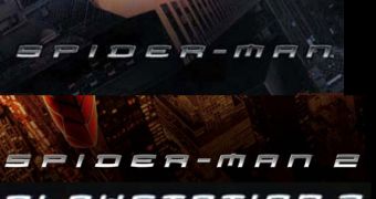
I'll bet only one percent of you PS3 gamers out there noticed something strange about the PlayStation3 writing on the shiny console. Don't worry, it's not something bad like peeling off after a months use, or getting rusty. It's just that...I've seen those fonts somewhere else before. Here's what we'll do: before reading the next paragraph (Don't look! You'll spoil your fun), see if you can figure out where you saw those fonts before.
I myself didn't even bother to think about it and did the same thing. I read on and found out from an article posted on CVG that, Sony's Ken Kuturagi was keen on using Spider-Man fonts for the PlayStation3 writing on the console's black, shiny case. So then it's Kutaragi we have to thank for this. I find that the fonts are quite nifty, better than any PlayStation logo before.
But how do you think they had the right to do that. Easy, Sony has full rights over the Spider-Man franchise. But let me tell you something even more interesting (than what I've already told you). The PlayStation3 fonts and writing were among the first things the company agreed on when work on the machine began. Pretty impressive, huh? In an interview with the official PlayStation Magazine, Teiyu Goto explained: "Take the PS2 logo - we created it to blend in with the rectangular shape of the console. Personally, I feel very strongly that the logo would not have looked right on PS3".
And he's right, the PS3 is the sexiest machine ever created. That cornery PS2 logo with a 3 instead wouldn't work. Teiyu continued: "It was also the wish of President Kutaragi, who insisted that I use this typography. In fact, the logo was one of the first elements he decided on and the logo may have been the motivating force behind the shape of PS3." See, I told you it was one of the first things they agreed on. OK, that's enough. Just thought you should know that's all...

 14 DAY TRIAL //