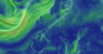
Supercomputers were recently put to good use for developing a stunning visualization of wind patterns on Earth. With the Earth Wind Map too, you too can keep an eye on how winds swirl across our planet.
You should be warned in advance that this tool is extremely time-consuming, in the sense that you will not be able to get enough of it. Though it may seem simply-built at first, the visualization can in fact be used to see wind patterns at multiple altitudes, and across a variety of projections.
The reason why this tool is so hypnotic is that you will be able to see how different winds flow at different altitudes. You will then spend a lot of time trying to put those overlapping layers together in your head for a 3D visualization of wind flow patterns around the Earth.
The data used in this tool is downloaded from the National Centers for Environmental Prediction's (NCEP) Global Forecast System, which is managed by the US National Weather Service and the National Oceanic and Atmospheric Administration. The map updates around 8 times per day.
You can also see winds as they appeared a day ago, or predictions of how they will flow 24 hours from now. Click the “earth” button in the bottom left of the image to access all options.

 14 DAY TRIAL //