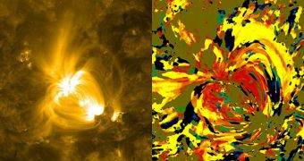
Nicholeen Viall, a solar scientist at the NASA Goddard Space Flight Center (GSFC), in Greenbelt, Maryland, developed a new visualization technique for converting raw number data from solar observatories into graphs and images. The new datasets look like van Gogh paintings, experts say.
Turning numbers into images can be done in a number of ways, investigators say, with varying degrees of success. The goal, obviously, is to extract as much scientific information as possible from the available data. The newly developed method does so in an innovative way.
Though not too common, there are several visualization techniques out there that produce not only informative, but also very beautiful images. Viall's approach is part of this small group, producing breathtaking photos that resemble amazing paintings more than they do scientific images.
However, don't let the looks fool you. Each stroke of color the technique produces contains a wealth of data about the activity that went on at that specific location on the Sun over the past 12 hours or so.
In fact, the expert say, each pixel in the images she produces contain information about how a region on the Sun cooled or heated over the past 12 hours. Studying our star's heat history is extremely important for understanding its temperature variations, and how matter moves under its surface.
“We don't understand why the corona is so hot. The corona is 1,000 times hotter than the Sun's surface, when we would expect it to get cooler as the atmosphere gets further away from the hot Sun, the same way the air gets cooler further away from a fire,” Viall explains.
One of the reasons why the new technique was developed is that Viall wanted to be able to distinguish between two competing theories – one suggesting that coronal heating is uniform over time, and another arguing that a large number of solar surface nanoflares are triggering it.
Developing the new technique would not have been possible without the use of high-resolution data from the Atmospheric Imaging Assembly (AIA) instrument aboard the NASA Solar Dynamics Observatory (SDO).
“In essence, I'm measuring the time lag of how long it takes a given area to heat up or cool down. But it's totally automated, with no need for humans to make a decision about what to incorporate or ignore. And all of the solar material is represented statistically, not just one wavelength of light,” Viall concludes.

 14 DAY TRIAL //