14 DAY TRIAL //
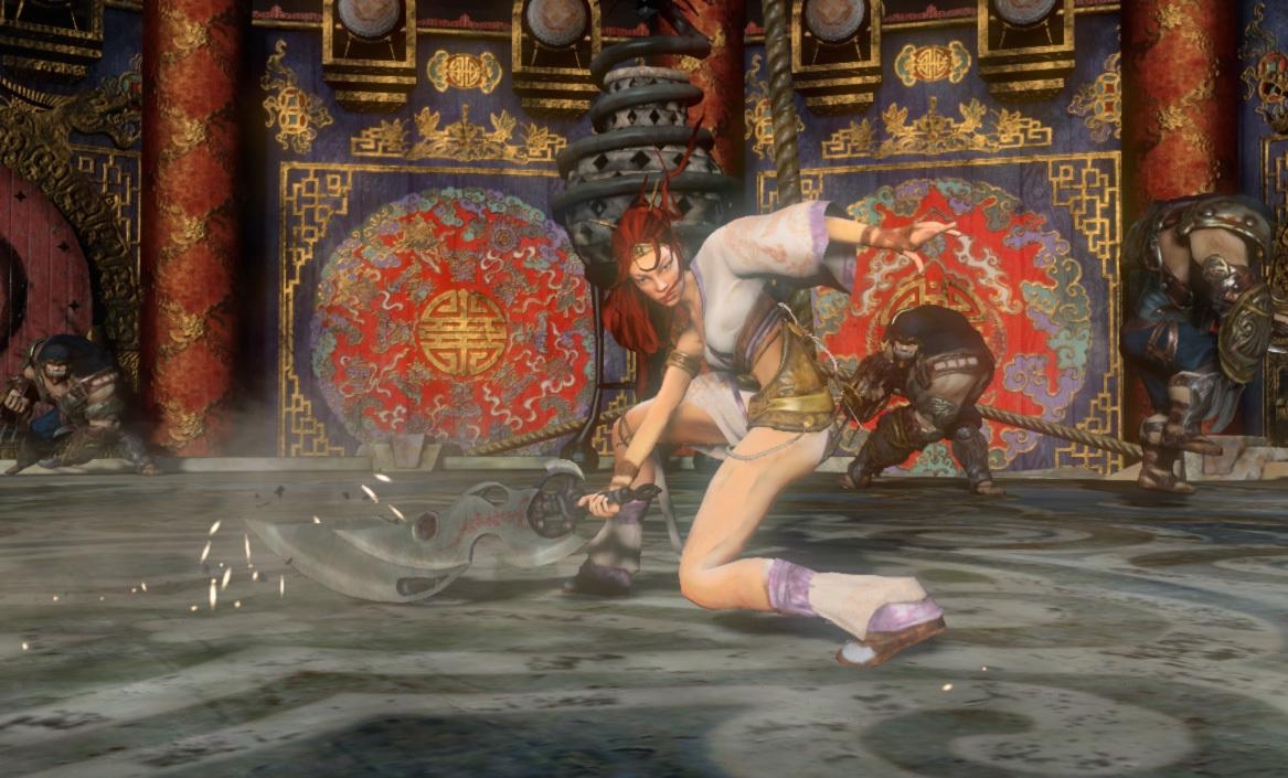
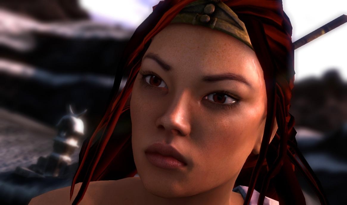
 After seeing that Ninja Theory changed Nariko's looks dramatically, fooling us with an image that should have been hers but looks more like Alyx from Half Life 2, these screens emerged. The fact that they look worse than what E3 in-game footage had to say about the game, doesn't come as a surprise; Ninja Theory has made a habit out of changing the game's appearance every few months or so.
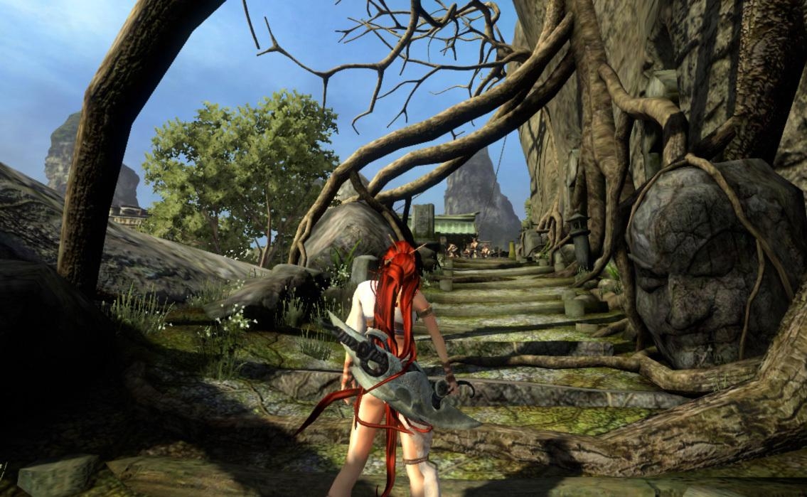
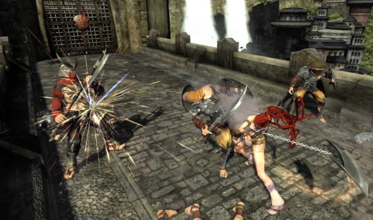
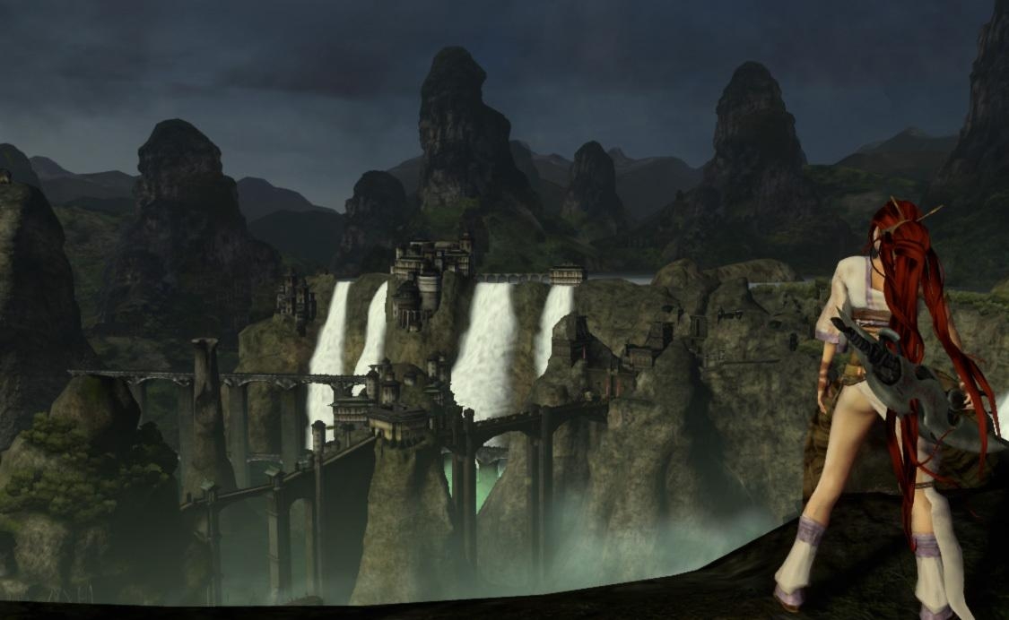
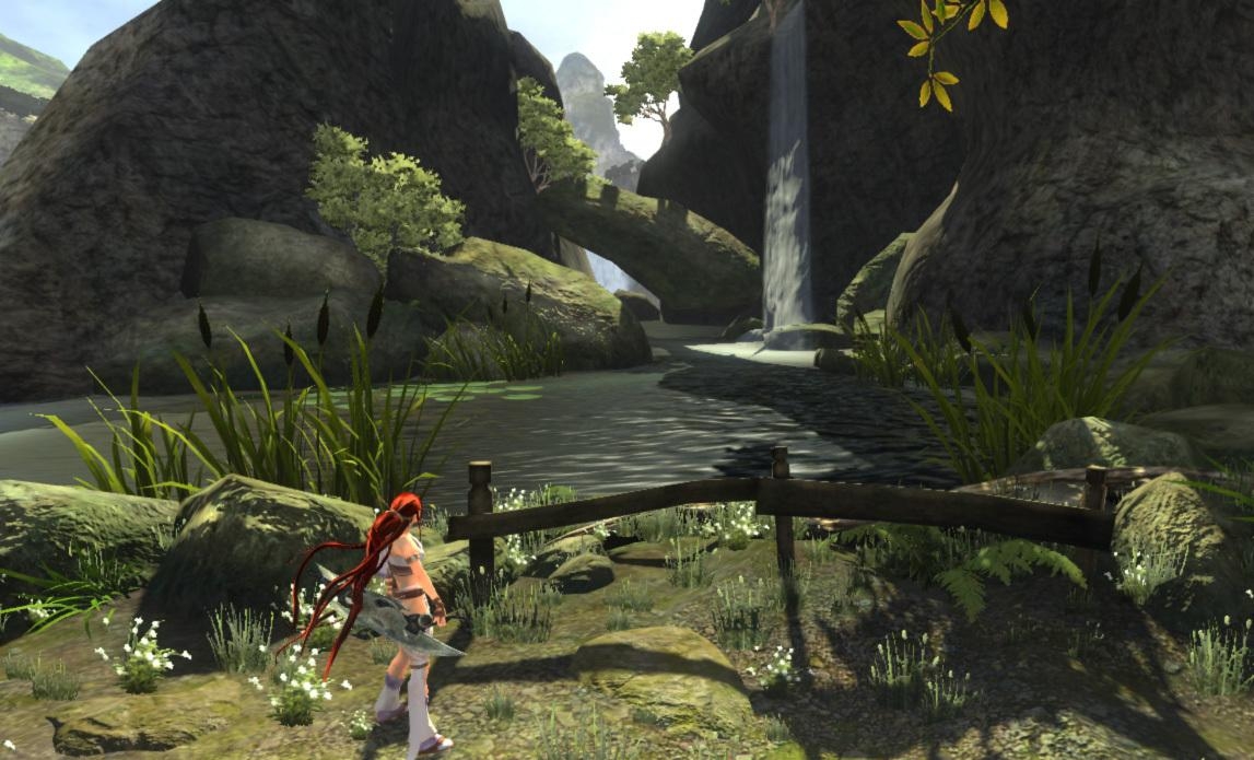
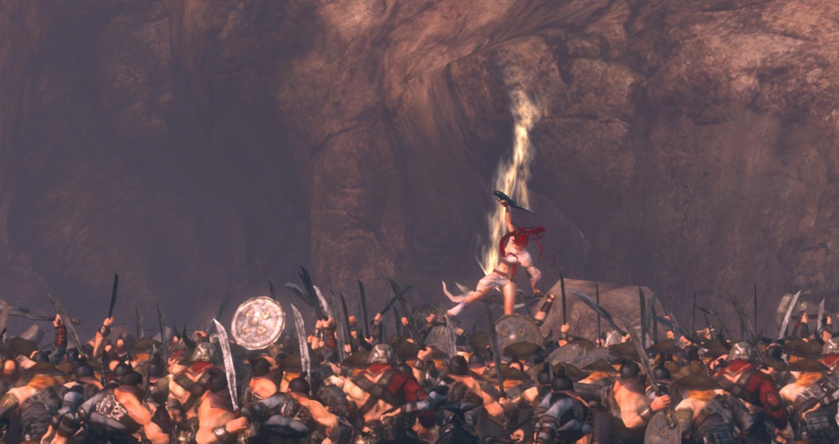
Check out the screenshots below. The game looks impressive nonetheless (it is a PS3 title after all), but how does a 2006 E3 trailer look better than recent work on the game? I'm sure they didn't swap looks with gameplay on Heavenly Sword - Nariko's looks make half the game's popularity, but more emphasized parts that later on proved to be useless for the game.
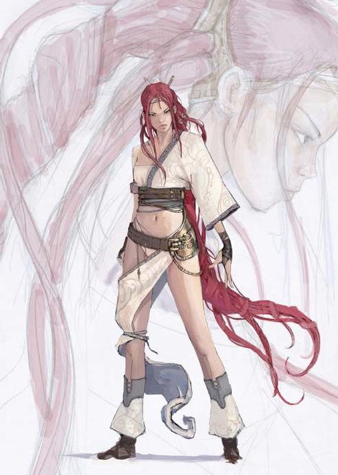
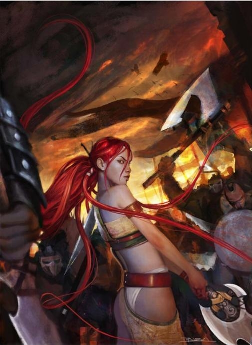
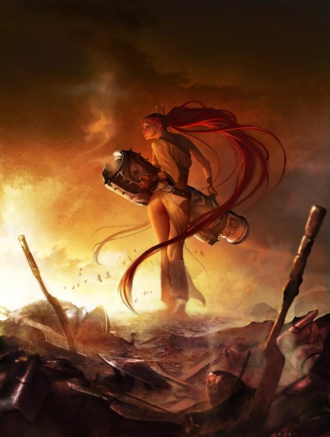
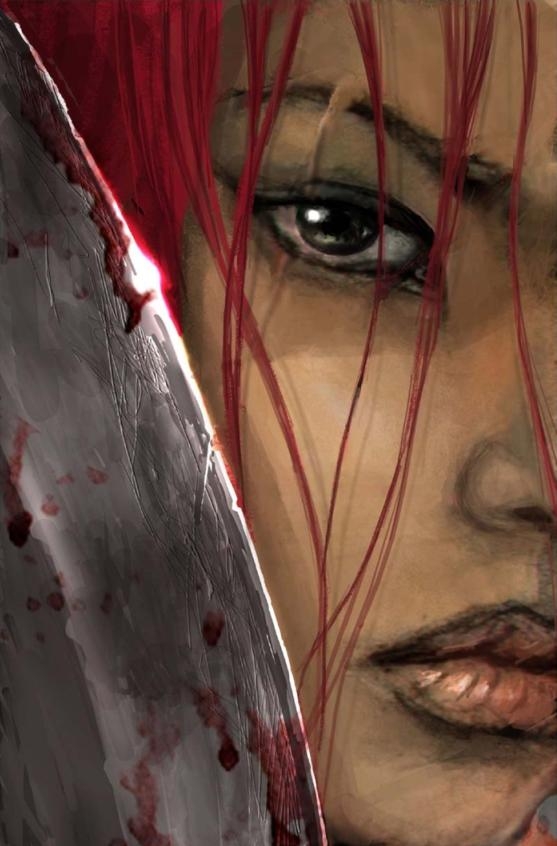
Come to think of it, if we leave aside any other piece of information on the game, artwork and images are breath taking. Just look at early Nariko (the first image in the concept art column). These guys know what they're doing over there at Ninja Theory; just look at the sexy scar, above the eye coming all the way down on her cheek. But she doesn't look as good in the supposedly in-game photos, if you've noticed. Less expression on the character's face.
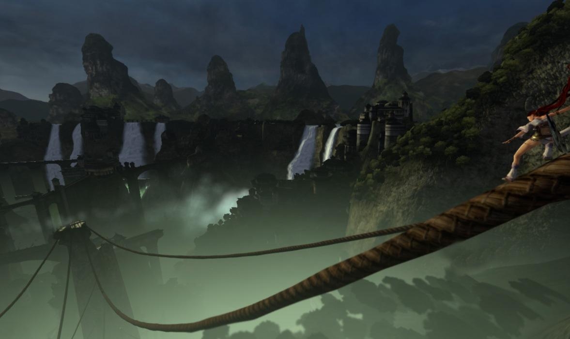
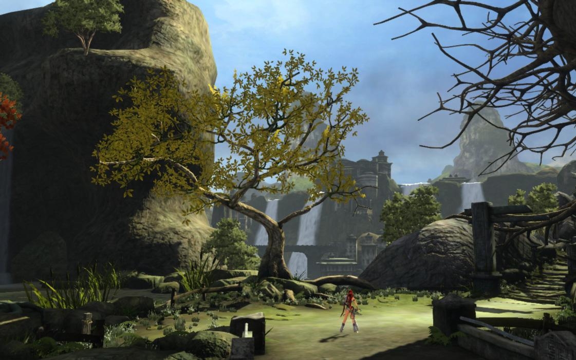
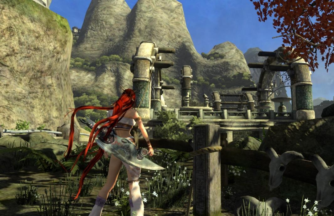
Screenshots also give away some of the facts about the game. First of all, color. The game screams "detail" - good for spotting an important item or grabbing an edge. Stages also look humongous, providing a great action experience with that far away over-the-shoulder perspective. As for the rest, you can figure out for yourselves when the game launches, but seeing these images kind of makes me forget about Lara Croft. I think it's time that I moved on to next-gen babes. Sorry Lara, it's been fun!
Concept art (pictures 1 to 4) and in-game screenshots below: