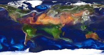
By now, most people are well aware of the fact that there are quite a lot of things floating in the air above our heads, yet this NASA map put together by the Goddard Earth Observing System Model satellite makes things a tad clearer.
The idea is quite simple: color-code each type of air particle and then show exactly how they mix and match once they hit the atmosphere.
In case anyone was wondering, dust is red, sea salt is blue, smoke from fires is green and sulfate particles from volcanoes and fossil fuel emissions are white.
Needless to say, environmentalists are bound to be quite concerned after having one good look at all the “white” swirling in the atmosphere, especially since most of it seems to come from heavily industrialized regions.

 14 DAY TRIAL //