14 DAY TRIAL //
 With the music streaming space getting crowded and things heating up ahead of the Spotify launch in the US and with a number of new services popping up, it was time for Grooveshark, one of the more interesting players in online music streaming, to step up its game. The service has launched a brand-new design that upgrades its already great interface but also adds some new functionality. Equally important, the back-end also got upgraded, making for a smoother experience.
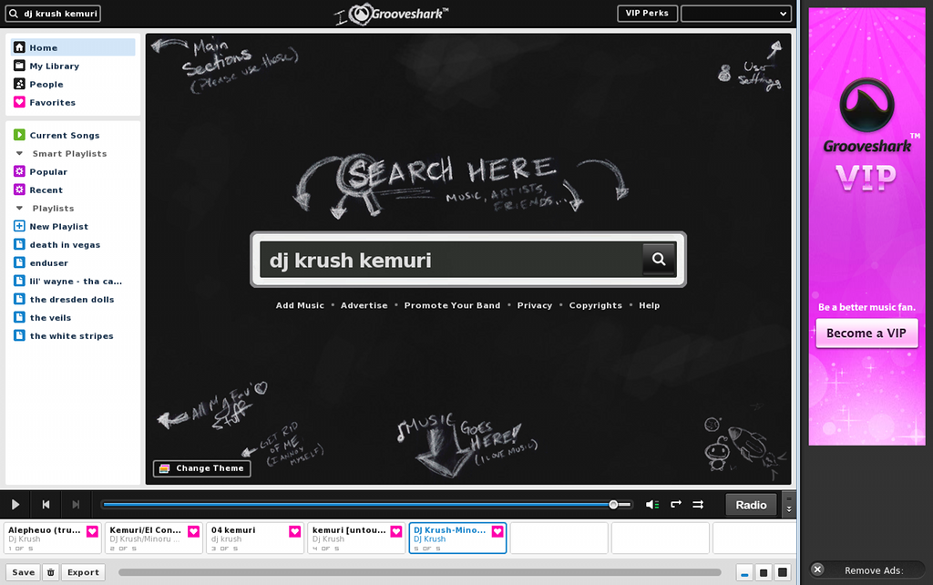
For the most part the elements are all there but the layout has been significantly altered. There is now a persistent sidebar that enables users to quickly access the main sections of the site, like the Library, Favorite songs, People and so on. Below the main links there is now a playlist section with some interesting new features.
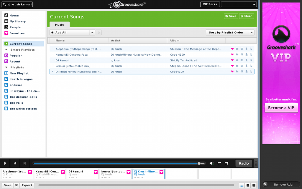
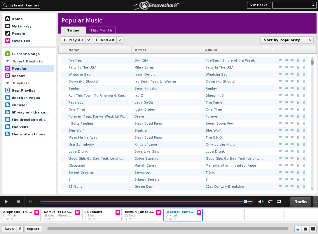
All of your saved playlists will be available without having to navigate through the menus but there are also a couple of Smart Playlists. The Popular Smart Playlist dynamically changes its content depending on what is popular on the site at the time and the Recent Smart Playlist is made up of the users' recently played songs. The best part though is the Current Songs playlist, which finally allows users to have a better overview than the cramped horizontal queue on the bottom.
Speaking of the horizontal queue, it too has gotten an upgrade. The player is now above the queue and features all of the basic controls you might expect. One welcomed addition is the ability to skip to any portion of the song which was previously impossible and, as a bonus, the feature is seamless with no pause in the playback when moving forward or backwards. There are now three views for the player, from small to large, and its size changes accordingly but the large player is only available for paying subscribers. You can also completely hide the queue if you want to.
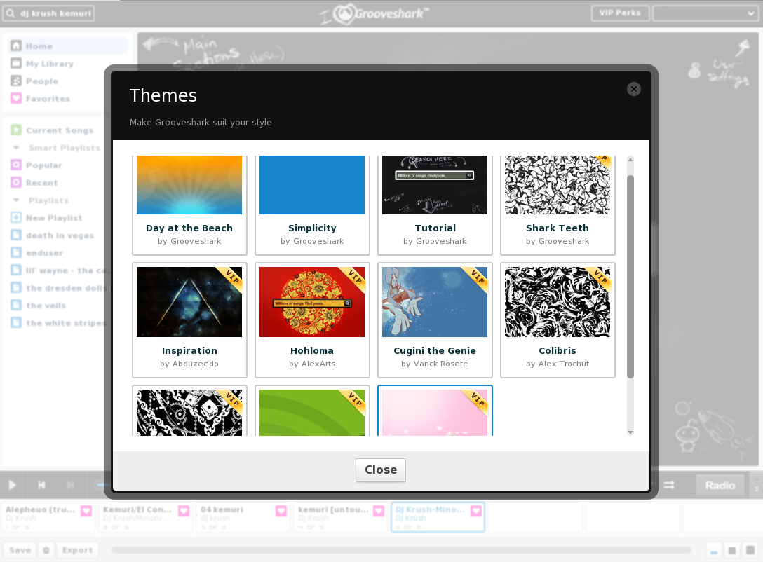
Along with the functionality changes the design also looks a lot better and users can even customize it with several themes, most of which are, again, only available to paying users. And to get started with the new design there is even a tutorial theme that gets you through the basics of the new layout. The new design is accompanied by some pretty big changes to the back-end. The site itself is significantly faster but playback is smoother also and pauses between songs are a lot rarer now.
While the app itself is now one of the best in the market, ad-supported music streaming services haven't done great financially so far and Grooveshark is no exception. There is also the issue of the legality of the service as most of the songs on the site are unlicensed and uploaded by the users themselves. Still, Grooveshark has managed to secure a licensing deal with EMI, after being sued by the label, so maybe things are moving in the right direction.