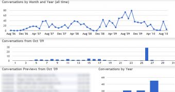
Graph Your Inbox is a Chrome extension which allows you to visualize your Gmail activity. It doesn't sound like something you really need, but it proves quite interesting in practice.
"Graph Your Inbox is a Google Chrome extension that allows you to graph Gmail activity over time," the extension's homepage reads.
"You can use it to visualize your communication with friends, your Facebook activity, when you purchased items on Amazon or how often you use certain words or phrases," the page explains.
"We provide the same search functionality used by Gmail, but instead of a list of messages we show you a graph of your email trends over time," it adds.
The extension is available from the Chrome online gallery, soon to become the Chrome Web Store. Installing it is trivial, after which you'll notice the new button in the toolbar.
You can enter a search query in Graph Your Inbox and then see how emails relating to that keyword have evolved over time. This alone can be pretty revealing, helping you to how often a subject or a particular work assignment has show up.
But since you can enter specialized searches, just like in the regular Gmail search, you can do more interesting queries like how often a particular person emails you.
You can do multiple queries and each new graph is stacked on top of the previous ones, so you can easily compare them.
It can be quite fun to see these trends, or pit your friends against each other to see who emails you the most.
And, if you're a heavy email user, there are probably a lot of things you wanted to know but didn't realize it was possible until now.
Since Graph Your Inbox is a Chrome extension, none of your data is sent to a third-party, everything is processed locally. You need to be logged into Gmail to use it and it only works for Apps accounts which have been transitioned to the new infrastructure.

 14 DAY TRIAL //