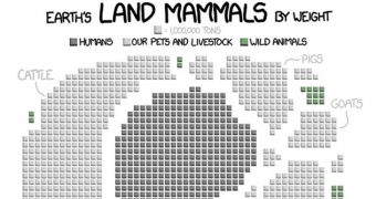
Randall Munroe, who used to work as a NASA roboticist, has recently pieced together this graph documenting how many wild animals are left in the world when compared to humans, their pets, and the animals that folks like to raise, kill and then turn into hamburgers and whatnot.
As detailed by Tree Hugger, the wild animals are the ones represented with the color green. That's right, those tiny green dots, which are shockingly few and far in between, document our planet's current wildlife population.
People, their animal companions, and livestock, on the other hand, are grey. Needless to say, the image is pretty much dominated by this color, so there is little doubt that, if there ever was a right time to step up conservation efforts, this is it.
In case anyone was wondering, this graph is chiefly based in information detailed in a book authored by Vaclav Smil and dubbed “The Earth's Biosphere: Evolution, Dynamics, and Change.” However, Randall Munroe admits that he did consult other sources as well.
According to conservationists and wildlife researchers, hunting, pollution and the expansion of human society – together with the destruction of natural habitats that the latter fosters – are the reasons why so few wild animals are now left to inhabit our planet.
Note: Make sure you click on the image above to get the full picture.

 14 DAY TRIAL //