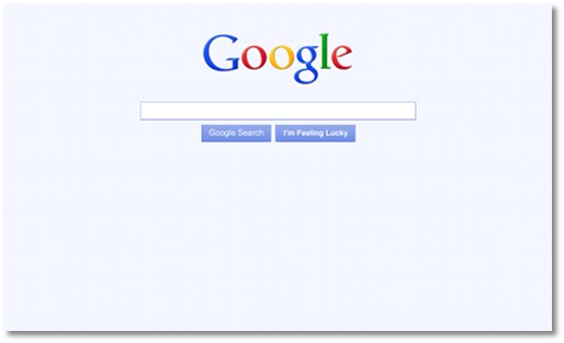
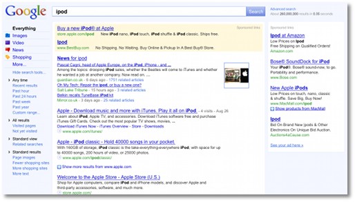
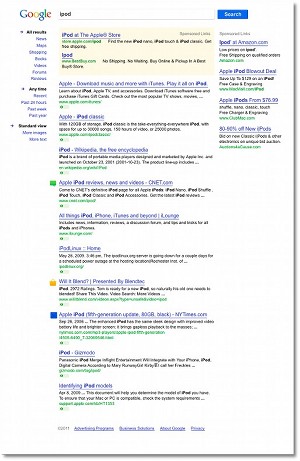
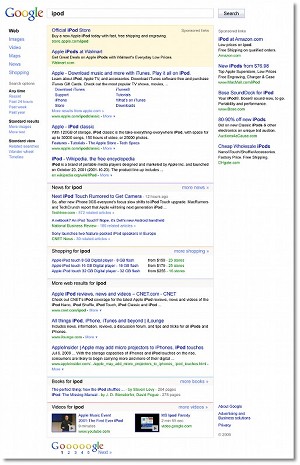
Google has recently revealed its redesigned homepage and has been rolling it out to users around the world. It’s a massive overhaul and one of the biggest changes in history for Google, certainly in the last decade. As you can imagine, the decision was not made lightly. In fact, work on the new homepage can be traced back to 2006 in one form or another. Google decided to let people in on some of the processes that led to the new design and even shared some of the versions that were rejected.
One of the biggest changes is the new permanent sidebar. It adjusts to the query you are conducting and provides you with additional tools and filters. Most of the options were already available on Google, but hidden by default.
“We’ve been creating mocks of left-hand panels since the earliest days of Google and have tested these designs with users as far back as 2006. Overall, we’ve found they can provide a great way to navigate without getting in the way of the main content, but they can also be distracting. Our users want more powerful tools, but they also want the simplicity they’ve come to expect from Google,” Jon Wiley, senior user experience designer at Google, wrote.
Google took a gradual approach by fist introducing the “Show options“ feature last year. With the new design, Google went all the way and made the sidebar visible by default.

 14 DAY TRIAL //


