14 DAY TRIAL //
 Only a few months back, Google.com introduced a brand new, Google+ inspired redesign. The layout was mostly the same, but the graphical elements had been updated to the new Google 'look'.
But since then, Google has been experimenting with several variations and tweaks, trying to get the layout just right. There have been several interesting tests, even a version with a fixed header bar.
Google has now started testing yet another version of the site, perhaps the most refined experiment yet, of the recent bunch.
It is similar to some of the ones we've seen floating around, but it comes in a unique combination of features and, well, colors.
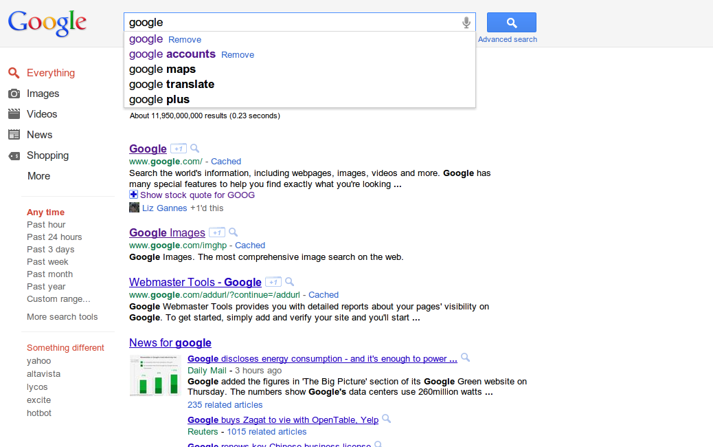
One of the first things to notice about the latest experiment is the brighter colors. It's not the first time Google wanted to liven up the site a little and the bright green and violet do stand out, perhaps a bit too much.
Everyone loves a lively design, but the saturation seems a bit over the top in this case.
Once your eyes adjust to the new colors though, you may notice that Google.com is a bit less cluttered, not that it was cramped before, and cleaner.
This is because of the left side bar which uses slightly smaller fonts and removes the icons next to the search categories. What's more, the search filter and option links now have the same 'weight' as the categories, everything seems more orderly.
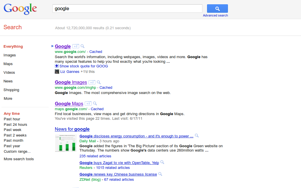
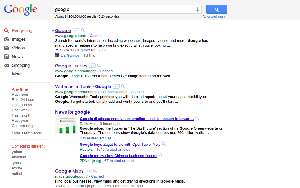
You may notice that the "Something different" section is gone as well, but this may be temporary or simply random. The new left sidebar is used for Google Image and Video search as well.
Google is probably getting closer to the final design that will be rolled out to all users. If it dials down the color saturation just a bit, this latest experiment is a winner.
With one, big caveat, the absolutely pointless "Search" bar below the header.
You'll notice that a fairly big portion of the screen is used up by this empty bar which only shows how many results Google has found for the query and how long it took, useless metrics that are hardly reliable in the first place.
The only reason why Google would use this bar is to get Google.com in line with some of its other sites, like Docs or Calendar. The difference is that Google uses that space on those sites for buttons and menus, it serves a functional purpose which it does not on Google Search, at least not for now.