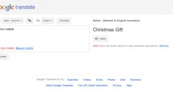
Google is continuing its massive design overhaul with yet another of its sites, Google Translate. The site now adheres to the new Google design mantra and is one of the first and few that have been converted in full. Granted, it's a simple site with few elements, so it wasn't that much work building or testing it.
Soon after Google+ launched, Google announced that it plans to roll out a new unified design across all of its sites. From the get go, Google Maps, Google Help, Google Calendar were converted to the new design.
The main search site had been undergoing a testing phase of the new design for a while, before Google made it official. Now, most people, probably all, see the brand new Google Search site.
But Google wants all of its properties, which are many, to put on the new clothes, and it's working on this one site at the time. YouTube is one of the latest to get a revamp.
The very latest to join the group is Google Translate. There's not much to the site, interface wise, so the revamp probably wasn't that hard.
The gray header is present, the bigger, skinned buttons for all of the features have been implemented as well. The new Google Translate looks slick, just like all of the redesigned sites.
And there's plenty more to come, Gmail is currently testing the new interface, several versions of it actually.
Several Google Apps products are doing the same, Calendar has implemented the new design, but expect the more complex apps, like Docs, to do the same eventually.
"We’re working on a project to bring you a new and improved Google experience, and over the next few months, you’ll continue to see more updates to our look and feel," Google explained when it announced the major redesign.
"Over the course of the next few months, look for a series of design improvements across all our products, including Google Search, Google Maps and Gmail," it added.

 14 DAY TRIAL //