Google is announcing that it is revamping some of the AdSense ad units introducing a new layout which should make them easier to read and understand. The changes are not revolutionary, nobody expected that, but the tweaks should make the ads stand out and make the actual info easier to spot.
“We're excited to announce a revamped design of three of our AdSense for content ad units! After analyzing publisher site layouts and reviewing requests around the world, we decided to make our formats more space-efficient and visually pleasing by changing the layout of the text,” Amy Wu, AdSense Product Manager writes.
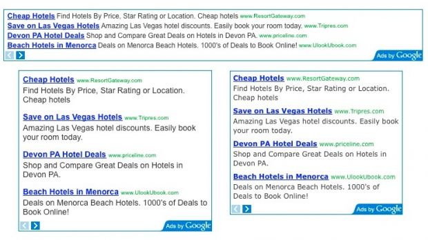
“We spent a lot of time experimenting with different possibilities, and we're starting with changes to the following ad units: Leaderboard (728x90) - the title, description, and URL are now arranged in rows instead of columns (except in the case when only one ad is showing); Medium and large rectangles (300x250, 336x280) - the URL is now in the same line as the title,” she explained.
You can check out the changes for yourself in the mock-up provided by Google. The URLs are a bit more de-emphasized and have been moved next to the tile for the rectangle ads, to save space, and to the right in the leaderboard ad unit. The biggest changes are to the leaderborad ads as the individual ads will now be listed in rows rather than columns. More ads fit in this way, but it may make them a bit harder to spot.
Google says that the redesigned ad units performed very well in testing. That’s not saying much actually, it they hadn’t Google wouldn’t be introducing them. The company is very thorough about its testing and most changes and new features go through a lengthy process. The new ads will be rolled out over the next few weeks.

 14 DAY TRIAL //
