Mountain View-based Internet giant Google is gearing up for the launch of a new flavor of its Google Play Store application for devices running under its Android operating system, and some more info on what it will look like has emerged online.
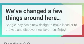
Courtesy of a screenshot posted on Google+ by a YouTube employee, we can now have a look at the Play store’s front page, which was unknown until now.
According to Android Police, the design matches the one spotted not long ago in a leaked Play Store build, and should prove a great improvement over the currently available flavor of the mobile application.
As can be seen in the screenshot, the upcoming iteration will arrive on devices with a new user interface, set to make it easier for users to find the applications they want.
The mobile software packs a new “Up” button, with the Google Play logo on it, which shows that the app is only meant for internal testing at the moment, and not for public use. The fact that the screenshot has already been removed from the employee’s Google+ page confirms that.
Google Play Store 4.0 will also come with a new icon for each of the various content sections available for users to access. These buttons are flat, with 1-color designs, and were not present in the previously leaked build, Android Police notes.
The action bar is still there, though chances are that it might be modified before the application arrives on devices around the world, it seems.
No specific info on when the new software version might be released has been provided as of now, but the next several weeks might bring some more details on the matter, given that the Google I/O conference is on track for the next month. Keep an eye on this page for more on the matter.

 14 DAY TRIAL //