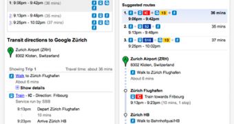
Google has just revamped the directions interface in Google Maps. The new interface should be easier to understand and relies more on visual cues rather than text. The changes aren't revolutionary but involve each aspect of the feature and go pretty deep.
"Over the past year, the Google Maps Directions team has been hard at work developing a variety of design improvements to make getting and following directions much easier," Jonah Jones, User Experience Designer at Google, said.
"It’s now simpler than ever to switch transport modes, change the time/date of your trip, get a high-level overview comparing different routes, and view details of a single trip at-a-glance," he added.
The changes are evident from the get go. While the new launcher looks pretty similar to the old one, several elements are easier to get to. For example, switching between directions by car, by foot, public transport or by bike (where available) is done with buttons rather than a drop-down menu as before.
It is a minor change but one that makes it easier to switch back and forth between the different modes and it's a good example of the type of changes in the new interface.
The suggested routes as well as the direction steps are now more visual. Icons and graphic elements replace the text-heavy old interface. The idea is to give the user a fast way of seeing the route and the different steps at a glance.
The suggested routes include a series of icons showing the various steps of a trip. For example, if you're choosing public transport, you will be able to see where you have to walk to switch trains, trams, subways and so on.
In the detailed direction steps each leg of a trip is also better highlighted and the walking portions are shown with a dotted line. The team plans to further refine the feature now that the first batch of improvements have been rolled out.

 14 DAY TRIAL //