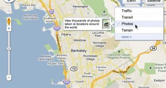
Google Maps has rolled out the refreshed interface elements it has been testing for months now. The tabs at the top of the map have been replaced with better looking and more intuitive buttons which enable users to switch between the different overlays and map types with ease.
"When we launched Google Maps, we had one layer -- the map. Since then, we’ve added more than ten different ways to explore the world around you, including photos, transit and traffic information, as well as satellite and terrain views. We’ve now updated the design so that you can more easily see and switch between the various viewing options that are available," Amanda Leicht, Product Manager at Google, writes.
The ancient looking tabs have been replaced by an icon which enables users to switch between the regular map view and the satellite view. It's just one button which changes depending on the map type you currently have selected.
If you're using the regular map view the button will read Satellite and vice versa. This makes sense but it can be a bit confusing, especially for new or less experienced users, since there is no indicator for the map view you're currently using.
If available for your browser, there will also be an "Earth" button to enable the 3D Earth View mode.
Enabling or disabling the secondary overlays, traffic information, webcams, photos and so on, is done trough a new menu below the view button which expands when hovering the mouse over it.
This can also be confusing since, when retracted, it doesn't indicate the layers you have enabled, rather it just displays the default Traffic or Photos, depending on the location.
Temporary layers, such as searches or directions are also listed in the menu widget.
The new widgets are definitely an improvement in the looks department. Usability is better too, since the different actions are more intuitively grouped. But they do seem like a regression in some aspects.

 14 DAY TRIAL //