It can be a nuisance to always have the same political talks over and over again with that neighbor that always seems to come back to you to convince you that he is right and that you don?t know squat about administration and policies. I know that. You know that (assuming you don?t shut down your brain into "humming not paying any attention" mode every time senators, members of the government or any other type of politicians are on TV). And Google seems to know that too.
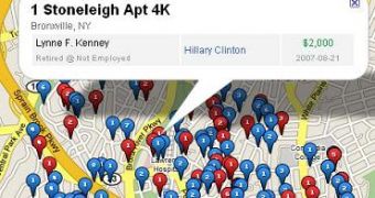
The latest idea it had and which it also put into practice was to map every contributor to the political campaign for everybody to see the colors their neighbors (or any random strangers) fly in a mouse click. This was done by mashing the data from the Federal Elections Commission with the help of US web site PoliticalBase.com and plotting it all on Google Maps for the world to explore. The project is named "The Map of 2008 Presidential Contributions."
"The data, downloaded and updated weekly, gets plotted by actual contributions and address locations of contributors. That means you can actually zoom down to street level to see the contributions people in your community are making! Zoom down to a specific area and expand the rolled up data icon to display contributions by street. PoliticalBase.com notes the following: All records are based on $200+ contributions to campaigns except for the 2008 Presidential campaigns, which include sub-$200 transactions as well.", is mentioned on the Google Maps Mania blog.
It?s a useful tool to always have at hand and next time you are in your slippers in your building?s hallway knocking on doors asking for a cup of sugar you?ll know better which doors to avoid and to which you can go wholeheartedly.

 14 DAY TRIAL //