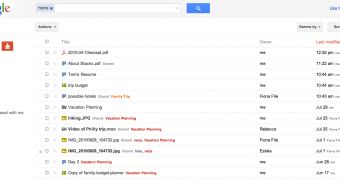
Google has started testing the new company-wide design and layout for Google Docs. Just like with Gmail, it's just an experiment and users have to opt-in, but anyone can activate the new look now.
Even if you use few Google services or websites, you've probably noticed the new design already. Google Search was the first to adopt it, along with Google+ which was built around the new design from the ground up.
"As part of our effort to provide an improved and consistent web experience across Google products, we’d like to invite you to try out a new look for the documents list that's rolling out to users over the next few days," Ted Chen, software engineer at Google wrote.
"If it's available to you, you'll be able to preview the new look by clicking on Try the new look under the gear icon in the upper right. You’ll be able to return to the classic look using the same menu," he added.
Note that the new design is only for the document list, none of the editors have been touched. If you don't get the option to switch to the new layout, try this link.
The new Google Docs looks airier and, unlike with other sites converted to the new design, it actually uses the space more wisely and more info and elements fit in the same page, provided you activate the "denser view" option, which you'll probably want to do.
Even with the denser view, the document list will still have fewer items than the classic view, but it's probably worth it since all of the elements seem to 'breathe' easier with the new design.
Along with the new document list design, Google is also introducing keyboard navigation and shortcuts. You can browse the document list using the up and down arrow keys.
You can open up a document by hitting Enter and you can do more by pressing the 'a' key which brings up the Actions menu. You can also create new text documents, spreadsheets or drawings by pressing Shift + 't', 's' or 'd' respectively.

 14 DAY TRIAL //