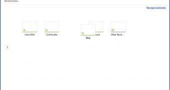
One of the big new features in Google Chrome 15, now almost ready for the beta, is the revamped new tab page. The page is split into three sections but offers much of the functionality of the existing new tab page, it's mostly a visual revamp.
There is one big addition though, the bookmarks section is much more complete. Currently, in Google Chrome 13 or 14, the new tab page lists the links in your bookmarks bar, if it's not enabled all of the time. There are also links to your bookmark folders, via a drop down menu.
For the rest of your bookmarks, you'll have to use the dedicated manager. The rest of the new tab page is filled with apps, recent and most visited websites.
In the revamped new tab page, there are three main sections, "Most visited," "Apps," and "Bookmarks." Each section focuses on what its name implies.
The Most visited section contains a list of frequently used websites. The eight most visited sites are listed, same as in the existing new tab page.
In the Apps section, the installed apps are listed along with a link to the Chrome Web Store.
The Bookmarks section, though, contains all of your bookmarks, not just from the bookmarks bar, but from your other folders as well.
The Bookmarks section is also split into more parts, you can switch between links from the bookmark bar and links from any other folder you may have. The links are displayed in a grid with a thumbnail, which doesn't yet work, the favicon and the tile of the page.
You can drag and drop bookmarks to rearrange them and also drag them to a recycle bin of sorts, if you want to remove them. It's much more visually pleasing and it's probably easier to manage bookmarks inside a folder, but you can't drop a bookmark into a folder for example.
As with the rest of the new tab page, the Bookmarks section is a work in progress so it's fair to expect some more fixes and functionality. For now, while it's certainly a visual improvement, as with the rest of the new tab page, it's not really a usability improvement too.

 14 DAY TRIAL //