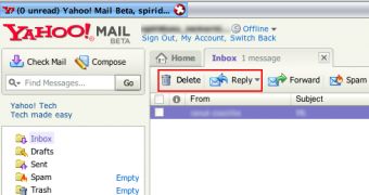
Today while I was reading an article about the Sunnyvale company Yahoo, an interesting comment caught my intention because it criticizes the folks working for Yahoo Mail. SandraDallas, the author of the comment, sustains that Yahoo Mail Beta received "an incredible stupid" update because two of the buttons were inverted, the parent company placing the Delete button in the place of the Reply one.
"I found that the "delete" button is now where the "reply" button used to be! I use Yahoo Mail Beta, don't know if it has happened on the regular version. And the reply button is now located, you guessed it! right next to the delete button. How incredibly stupid to put those buttons right next to each other," the user said.
A long time ago, the Sunnyvale company debuted the beta version of the mail solution that was meant to represent a real POP3 interface for the web-based product. Recently, it started to introduce one of the major updates prepared for the mail solution, implementing Yahoo Messenger and unlimited storage size for all the users.
As you can see, some of the updates made for Yahoo Mail might disappoint the users; moreover, they can make users revolt against the parent company. Although I agree that it's not quite an intelligent move to place the delete button in the place of the reply one, the user must be very cautious when it comes to email messages. However, Yahoo managed to attract some angry users on its side, users that might decide to look for an alternative to the famous Yahoo mail service.
"In all my years of using software and the internet I have never been so disgusted. The day the ads showed up I called technical assitance and was the 72nd caller! And they claim they haven't had very many complaints!" the angry user concluded.

 14 DAY TRIAL //