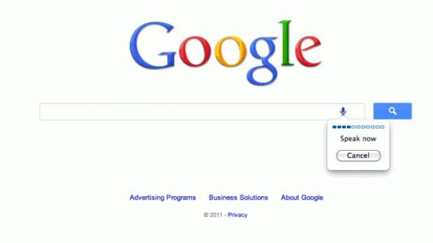
Google is testing a redesigned homepage and search results page. This is hardly something surprising, Google is always running experiments and tests, but this latest one seems rather widespread. The new homepage features no "I'm feeling lucky button" and only a single, blue search button.
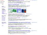
The search results page is even more extensively redesigned, the top of the page has a grey background, the left sidebar features grey section links and the result snippets have been modified as well, for example the URL is right below the title link, rather than at the bottom.
The redesigned Google Search has been spotted by several users, around the world, so this seems like a rather large experiment and possibly an early roll-out.
The new homepage is similar to the current one, though it's a bit more simplified, not that there's much to get rid of in the first place. The iconic "I'm feeling lucky" button is gone, for one.
The "Google Search" button has been moved to the right of the search box and is now a simple blue button with a search icon. Links to "Advanced search" and "Language tools" seem to be gone as well.
Of these changes, the most symbolic is the loss of the "I'm feeling lucky" button which has been around as long as Google Search has.
It was a symbol not only of Google's might - it was confident enough in its algorithm that it believed the first result would be the best for users - but also of its more human and playful side.
However, the button has become obsolete, especially with the advent of Instant Search since it goes away as soon as you start typing.
Though there is an "I'm feeling lucky" link in the search suggestions, this probably got even less clicks than the original button.
The search results page has more drastic changes, though they hardly seem like good ones. The header, the part with the search box and the Google logo is now cut off from the rest of the page and has a grey background, in some cases with a slight blue hint.
The categories and icons in the left sidebar are all grey except for the selected category which is red. Dead links are usually red and greyed-out ones usually indicate that they're unavailable, so the choice of colors is rather unfortunate.
There are plenty of other small changes, overall the experiment is a rather large one. There are likely several versions of the redesign going around. Google has always done extensive testing, especially of its design, so, hopefully, it will keep the changes that make sense and drop the ones that don't, like the new colors for the sidebar links. You can check out all of the graphical elements of the redesign in this sprite.

 14 DAY TRIAL //
