14 DAY TRIAL //
 Google Correlate, a search analysis tool Google saved from its defunct Labs project, has gotten a really cool feature that enables users to find search trends by drawing a graph line. It may not seem particularly useful, but it's quite fun.
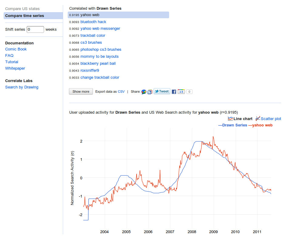
There is actually a practical use for the tool, dubbed Search by Drawing, for example, if you already have a graph and want to see if it's linked to any trend that Google Search has tracked, but you can't or don't want to upload your own time series.
The tool is relegated to "Correlate Labs" for now, indicating that it's an experimental feature. But it's easy to use and provides some really surprising results.
As the name implies, what you need to do is to draw a time series right there on the page. You can go wild with it and Google will still find some searches which follow that trend.
After you're done drawing, just click the Correlate button and let Google do the hard work of matching your graph to known search trends.
In no time, you'll get a series of queries which have grown, or decreased, in popularity similar to the graph you provided.
Because of the way Google Correlate works, the tool was actually quite simple to create.
Correlate works in two modes, either you provide a search query and it tries to find other queries that follow a very similar patter, or you provide a time series of your own and have Correlate match it to its data.
The Drawing tool simply converts your scribble into a time series and then compares it to the trends it knows of.
In the screenshot you'll notice that the drawing, which is completely random, matches the volume of searches for "yahoo web" and "yahoo web messenger." You'll notice that the volume sees a drop after 2009, around the time Yahoo integrated IM features into Yahoo Mail.