As the years go by, it's good to see that Apple's products add cool new features, more storage capacity, thinner designs, and breathtaking user interfaces. Then again, it's always good to remember where it all started, like, for instance, who bit the apple used by the company to identify itself – its logo.
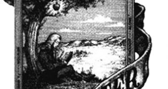
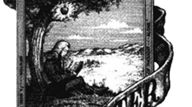
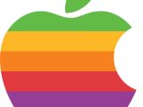
Well, Apple’s first logo, designed by Steve Jobs and Ronald Wayne, was almost immediately replaced by Rob Janoff’s “rainbow Apple.” Some sources say that the new rainbow-colored shape of an partially-bitten apple was possibly a tribute to Isaac Newton's discovery of Gravity, while the rainbow represented the separation of light by prism. Apple didn't immediately decide on the logo, but when Janoff presented it to Jobs in 1976, Apple's CEO considered it to be a winner.
However, while the “rainbow” logo had a more than respectable lifespan, no one really knew for sure what it stood for. Yes, it was generally accepted to have still been in reference to Isaac Newton, but a curious urban legend also said that the bitten apple was a homage to the mathematician Alan Turing. Turing committed suicide by eating an apple he had laced with cyanide. Some analysts suggest that Turing was re-enacting a scene from “Snow White” (his favorite fairy tale). Since Turing is regarded as one of the fathers of the computer, and knowing how much Apple likes to stick to its roots, we can all accept this as a possibility.
Apple then began to use a monochromatic logo, supposedly in light of Jobs' comeback, nearly identical in shape to its previous rainbow incarnation. It's the logo we're used to seeing on Apple products today. The bite was still there when the new logo was picked, however, no specific color was prescribed throughout Apple's software and hardware line. Apple probably knew it was going to revolutionize the world of electronics, which would also imply changing the feel of the logo to accommodate a certain product.
Also worth noting was that one of Apple's first slogans (if not the first) was "Byte into an Apple," coined in the late 1970s. Starting with 1997, Apple used the slogan “Think Different” in its advertising campaigns, and still does to this day.
Apple's logo, shaped like a bitten apple, is one of the most iconic brand symbols in the world. It identifies Apple products (and retail stores) so well that it eliminates the need for Apple to write the company's name in letters on any of the products. Apple has been including its logo as stickers in nearly all Macintosh and iPod packages through the years. Some of the older Macs shipped with the “rainbow” Apple logo long after it had been dropped.

 14 DAY TRIAL //

