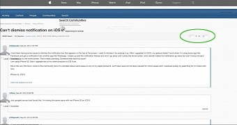
As we were browsing the Apple Support Communities forum looking to learn more about the iOS 8 notification banner issue, we were greeted by the badly-loaded page displayed in the screenshot over to the right.
The spinning (loading) wheel was enough to take us on the refresh path, but then we noticed the thick blue strip backgrounding the Activity, Content, People, Communities, and Search tabs. And then we noticed the arrows for the page numbers.
Not your typical badly-loaded page
Granted, the text is out of proportion in some areas, sometimes overlapping, and the spinning wheel says it all. It’s not assembled properly, either by Apple, the CDN, or our browser. But whatever was going on at the time we accessed that page, we can’t help but wonder why the page buttons looked completely different.
Sure the blue strip at the top could just as well be a glitch. The reply boxes, neat as they may look, could also be glitchy (they too contain some graphical elements that suggest not all is right with them). But the page buttons. There’s no glitch there. Those are different.
Apple could be trying out a new design
Formerly known as Apple Discussions (or something), Apple Support Communities is the official Apple forum. There, people come mostly to complain about their products not working properly, whether it’s their own fault or Apple’s, but also to socialize, brag about their latest iDevice purchase while seemingly trying to solve someone’s problem, etc. It’s a fun place to be.
Apple keeps it neat and almost fully-white themed. It’s one of the most elegant forums out there, but it doesn’t have to stay like this forever. The company gave it this redesign when it switched from Discussions to Communities. Maybe now they’re doing it again.
Truth be told
We wouldn’t mind seeing the forum adopt these new color sets and graphics. In fact, this glitch (or whatever it was) got us thinking. The forum looks more readable and friendlier this way. As glitchy as it may appear, if you straighten everything out, it really looks like a state-of-the-art forum. And the blue theme is responsible for most of this.
But to be honest with you, we’re not convinced that Apple is trying out new designs either. But as long as it’s a possibility, we can’t not share it with you guys. So what do you think? Would you like Apple Support Communities to get a new face?

 14 DAY TRIAL //