14 DAY TRIAL //
 The mobile Web has moved away from being a niche on the Web, and if you think the contrary, then you're stuck in 2004, my friend.
Not only did it break out of a niche sector, but it is now a mainstream current in all that the Web stands for.
According to the annual dotMobi “Mobile Web Progress” report issued late October 2010, since 2008, the number of mobile-ready websites has grown from 150,000 to almost 3.01 million, registered today.
The staggering 2000% rise in mobile-ready websites is a direct trend of the increased attention mobile devices, especially smartphones, have been getting from top-level domains like YouTube, Twitter and mainly Facebook.
Major Internet players have been fighting for every piece of land left undiscovered in a quest form more and more visitors.
Users are the life source behind a website, and since the mobile market grew tremendously these later years, mobile device owners are now the target of any website looking to expand and grow its audience.
Going away from the classic marketing strategy “Tarzan want users, Tarzan use a trillion ads on every site around,” Internet companies, in their continuous drive to enlarge the mother ship's user base are now focused toward porting as much functionality of the original website to the mobile version.
The attention mobile devices have been getting from major companies like Facebook, Yahoo, Google, Microsoft and many others have drawn the interest of regular Joes owning an Internet Web page.
While not that many website owners have been porting their website to a mobile-ready version, this can be explained by many reasons.
First, we have the one called “money.” Mobile development is not cheap.
This is mainly due to the fact that not that many people know how to do it, or where to start from when developing/porting a website for a mobile device.
For now, development costs are still high, but as every other trend around, they will go down as more and more developers learn the skills and start advertising their services.
Second barrier is “usability.” Not that many webmasters find a real economical or usability purpose to do it in the first place.
What if you were the owner of a small e-commerce website running your own payment platform?
The well-known Amazon spent a lot of time and money porting its payment tools for mobile devices with the launch of the Amazon Mobile Payment Service (MPS) in October 2009.
While the security of overall mobile payment systems is still disputed, users usually stay away from online shops mainly because of the small screen size prevents them from reaching a ready-to-buy state after analyzing the product pictures.
Big e-commerce shops, and other similar presentation websites, usually want users to browse their website and save links for later browsing when they get home.
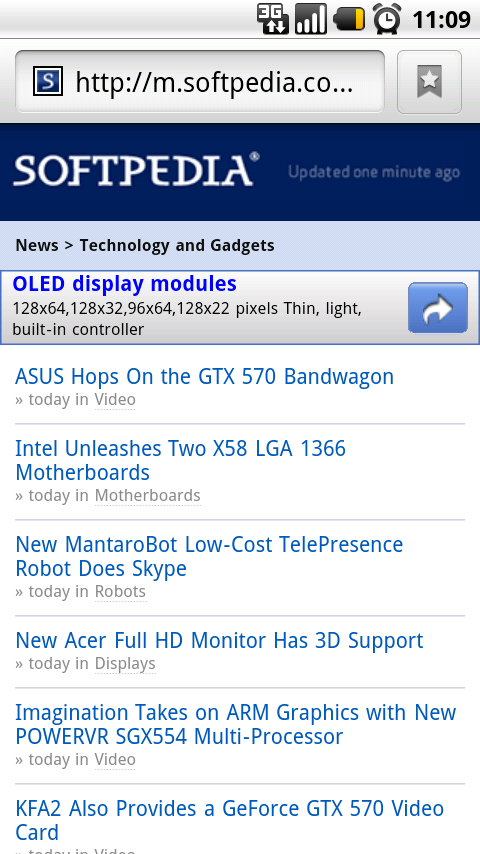
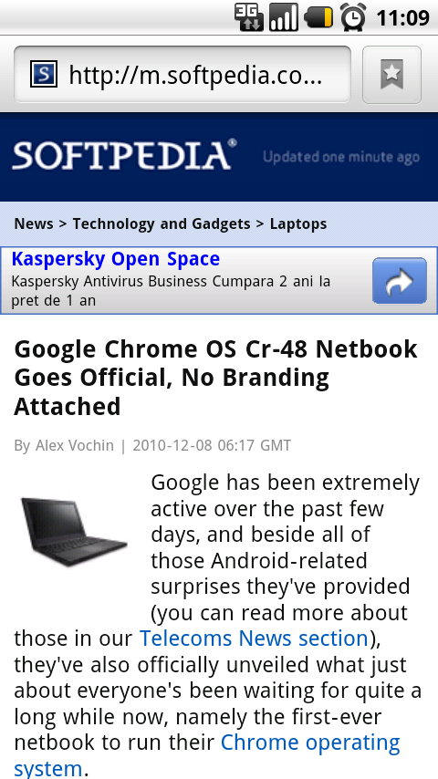
For example, this website. www.softpedia.com is split in many sections. Some of them can be ported with success onto a mobile version, especially the News, Handheld or Mobile sections (see screenshots below the editorial). Other sections (Windows, Mac, Drivers, Games, Linux, Scripts), due to their nature can be browsed, and bookmarked for later access from a personal computer where the indexed software can actually be downloaded, installed and used with success, since there's no “technical way” or “logical reason” for installing those kind of programs on a mobile phone.
Nevertheless, the site is still useful, but if you are not a big company and have small funds or a very small user base, this may not be that important and useful at the moment.
This is one of the reasons that many websites won't have (in the coming future or quite never), a mobile version. It’s especially true for small blogs or personal sites. They just don't really need it and the costs and hassle for porting the website are not worth it.
For now, the same dotMobi report has only 40.1% of the Alexa Top 1,000 websites as mobile-ready, with the percentage going down to 29.7% for the top 10,000 and 19.3% for the top 500,000 websites.
But let's go over some major development tools that have introduced a version of their software/code which will allow developers to port some of a website's major functionality to mobile devices.
We will start with the two kings of the Internet: jQuery and WordPress.
We say kings because they are absolutely dominating their market corner by a huge margin over any other competitor.
According to statistics from Builtwith.com, at the end of November 2010, WordPress was running almost 90% of all blogs on the Internet, while jQuery was used on 41% of all websites. Adding the jQuery UI percentage, the overall jQuery share goes to 47.85%.
jQuery Mobile
Currently still in alpha development, it's already a powerful development tool, providing a unified user interface system across all popular mobile device platforms.
In simpler words, it's a jQuery UI port for mobile devices, allowing easy interface prototyping and component loading when building a mobile website interface. Just like in the case of building a website with jQuery UI.
With support available and some more planned, jQuery Mobile can be used for the Blackberry OS, Android, iOS, Symbian, Windows Mobile, Palm webOS, Meego, bada and Maemo.
Expect it to be one of the top notch development tools around. Just like its parent. Until then, you can download the latest version of jQuery Mobile from our Scripts index at this link.
WordPress
Automattic, Inc. has shown great interest for the mobile market, offering 4 extra WordPress versions, side by side with their hosted and self-hosted blogging solutions. Just check out these versions for the Blackberry, Symbian, iOS and Android platforms.
Download WordPress for Symbian from Softpedia Handheld here. Download WordPress for BlackBerry from Softpedia Handheld here. Download WordPress for iOS (iPhone/iPad) from Softpedia Handheld here. Download WordPress for Android from Softpedia Handheld here. Download the classic WordPress version from Softpedia Webscripts here.
A BuddyPress Mobile version is also available, along with a huge amount of user-developed mobile device-targeted plugins in WordPress.org's Plugin Database.
Magento
Widely considered as the best e-commerce platform on the web, a Magento mobile admin dashboard has been recently presented at the Bargento November meeting by one of Magento's partners. A demo can be seen below via YouTube.
The app is built using the Titanium framework and will be made available on Magento Connect in the coming months.
There's also Magento Mobile, a commercial mCommerce solution for displaying Magento websites on mobile devices. But since it's available under a commercial license, there's not that much community interest in it.
Ext JS
Maybe not Ext JS itself, but the company behind Ext JS, Sencha Inc. has recently launched a top-notch mobile development tool, mainly built around HTML5.
Known as Sencha Touch, it just reached the 1.0, production-ready mark.
The tools are heavily marketed around the web as the first and most complete HTML5 mobile JavaScript framework. If Sencha Touch is as good as Ext JS, there's no doubt it will become a community favorite.
Download Sencha Touch from the Softpedia Webscripts index here.
Zend Framework
Mobile support has been officially added in the Zend Framework with its current and most recent release, version 1.11.0.
Most important features include user-agent detection and device capabilities detection, based on the detected user agent.
Download the latest Zend Framework version from the Softpedia Webscripts index here.
Drupal and Joomla
We weren't able to find official Drupal or Joomla mobile versions, but the module directory is quite full with plugins offering plenty of mobile support. Some of them introduced even since 2006.
CSS Frameworks
Modeled after the 960 Grid System, the 520 Grid System framework is just perfect for web-designers, graphic artists and UI developers.
The framework is updated frequently and spurned much community support.
Some other useful tools
PyMT, an open source Python library for developing multi-touch applications.
jQTouch, a jQuery plugin for mobile web development on the iPhone, iPod Touch, and other devices. It offers support for easy native WebKit animations, image preloading, callback events, themes, swipe detection and building extensions. Other jQuery plugins for mobile web development include: jQuery Retina Display and Touchwipe.
MooTools Mobile – not a real MooTools release. Nevertheless Christoph Pojer has done a nice job porting basic mobile detection features into a MooTools class. Other MooTools plugins targeting mobile devices include Mouse2Touch, MooSwipe and MooRetina.
T1E HTML5 Reset, a mobile and Facebook ready HTML5 reset stylesheet.
prettyMobile, an iPhone/iTouch website development toolkit, developed on top of the Sizzle JavaScript library, the same selector engine used by jQuery.
baseJS, a lightweight JavaScript framework intended for use with Mobile Safari on the iPhone and iPod Touch. Mobile Detect, a PHP class for detecting the type of mobile devices accessing a site. Other PHP classes for mobile development include mobiled and Mobile Verification.
The trend of mobile adoption will continue, since more and more, people are using mobile devices to access the web.
Maybe for now, we need tools to adapt our websites for mobile devices, but as unpredictable as the market is, this won't be the case as websites, devices, standards and development tools continue to evolve into more and more complex tools.
Who knows, maybe a day will come when we need only one or two libraries for writing an all-out compliant website for any kind of displaying device around.
Don't forget to check out Softpedia's mobile version at http://news.softpedia.mobi or http://m.softpedia.com/