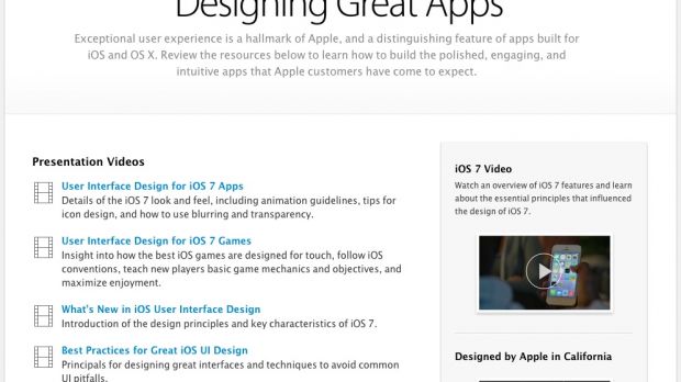
A new and highly-valuable developer resource is available on Apple’s web site starting this week, offering convenient tools and documentation to amateur coders and hardcore programmers alike.
Titled “Design Great Apps,” the new “design” section on Apple’s Developer site is exclusively focused on the look and feel of apps for iOS and OS X.
“Exceptional user experience is a hallmark of Apple, and a distinguishing feature of apps built for iOS and OS X. Review the resources [...] to learn how to build the polished, engaging, and intuitive apps that Apple customers have come to expect,” says the company.
Broken down into two major categories, the resources include Presentation Videos and Guidelines and Documentation.
Developers can learn the subtleties of iOS 7, including animations, icon design, blurring, and transparency, or gain insight into how to make a great-looking video game, complete with comprehensive instructions to teach a player basic game mechanics and objectives.
Other videos talk about the design principles and key characteristics of iOS 7, the key principles for designing great interfaces while avoiding what Apple calls “common UI pitfalls,” and even an in-depth look at how the iPhone maker created iPhoto for iOS.
The Guidelines and Documentation section covers iOS Human Interface Guidelines, UI Design Dos and Don’ts, UIKit User Interface Catalog, the iOS 7 Transition Guide, and OS X Human Interface Guidelines. As you’ll notice, OS X has a very small focus on this particular area of Apple’s Developer site.
Pictured below is an example of Apple’s way to explain Dos and Don’ts to the developer.

“Create a layout that fits the screen of an iOS device. Users should see primary content without zooming or scrolling horizontally,” says the Mac maker. “Use UI elements that are designed for touch gestures to make interaction with your app feel easy and natural.”
Instead of making small buttons, developers should consider creating controls that measure at least 44 points x 44 points “so they can be accurately tapped with a finger,” Apple says.
If your app has a lot of text in it, Apple recommends that you set it somewhere at 22 points or above “so it's legible at a typical viewing distance without zooming.” Equally important is to make sure you have ample contrast between the font color and the background.
These tips may seem logical at first, but as you’re busy coding hard, they come in pretty handy. Why waste time revisiting your code hundreds of times to make adjustments, when you can get it right from the get-go?

 14 DAY TRIAL //
