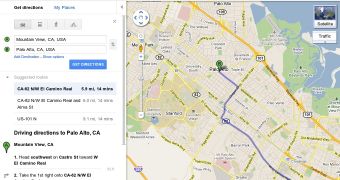
Google wasn't kidding when it said that it planned to update the looks of all of its websites. While many people have already spotted the new Google Search, Google Maps is getting a refresh as well, in line with the new Google design mantra.
"Over the years we’ve made some significant improvements to our map style. This summer, we’re starting a new project to give you more map and simplify the overall look and feel. As part of a larger effort, Google is bringing you an experience that’s more focused, elastic, and effortless," Evelyn Kim, visual designer at Google, wrote.
And, unlike the Google homepage redesign, which is still in testing, the new Google Maps is live for everyone.
If you've landed on one of the experimental homepage versions, or seen some screenshots of the new Google+ one, the redesigned Google Maps will feel familiar.
In fact, that was the main point of the redesign, Google wanted all of its websites to have the same look and feel.
The new Google Maps has the same slightly darker header, containing the search box with the new blue search button and the Print, Email and Link buttons.
Below, you'll notice familiar elements as well, links are being replaced by buttons, wherever it makes sense, and the color scheme follows the global one. The new slim and themed scrollbar makes an appearance as well.
Most of the changes are subtle, but once you've seen it in action, you won't want to go back to the old design. This is just the beginning though, expect other Google products to get a new coat of paint soon.
"Whether you use Google Maps to discover new places, or to seek out destinations you know well and love, we hope you’ll find our updated look as familiar and reliable. It’s simple polish with focus on what’s most important—your map," Google concluded.

 14 DAY TRIAL //