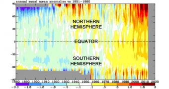
There are still a lot of climate deniers out there. Hoping to shake their disbelief that global warming is as real as it gets, NASA has released a chart that documents changes in global temperatures that have taken place since the year 1880 until present day.
As one can easily notice in the picture above, from 1880 until the 1920s, blue and green are the main colors on the chart.
Global temperatures begin to steadily increase in the 1930s and continue to do so until the 1970s, hence the fact that yellow, oranges and shades of red work their way into the chart.
It's in the 1970s when things really go haywire, and oranges and reds become the main attraction. According to Tree Hugger, most of this red and orange is due to noteworthy warming in the Arctic region.
One can only hope that this chart will help put things into perspective for those who still think global warming and climate change are hokum.

 14 DAY TRIAL //