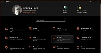
If you’re an early Windows 10 adopter, you certainly know that the Settings app in the OS has become one of Microsoft’s priorities and is the modern home of everything originally included in the classic Control Panel.
And while Microsoft needs more time to migrate all Control Panel options to Settings, the company also tries to refine the experience with the new menu, all in an attempt to make everything more straightforward for everyone.
One of the latest improvements rolled out for the Settings app is the banner at the top of the UI, which displays essential information like user account, email, OneDrive quick access, and Windows Update.
The purpose of this improvement is exactly this: display essential information and provide users with quick access to certain features.
Microsoft first introduced the new Settings header back in Windows 10 build 18305 released in December 2018 and then rolled out in Windows 10 May 2019 Update for production devices. Microsoft explained in late 2018:
“We’re introducing a new way to help users finish their Windows setup and quickly access some of the most frequently used settings. Inspired by the Microsoft account homepage, the Settings home page now has a header at the top allowing you to take quick action for things like signing in and managing your Microsoft account, making the Windows and Microsoft experience better. It also gives you an easy to glance at system status, such as when updates are available.”
However, there are users who believe that the Settings banner barely improves usability in Windows 10 and, in fact, it actually eats up too much space on the screen without offering enhanced functionality.
Many think Microsoft should allow users to customize the Settings header with their very own shortcuts, which at some level makes sense given the whole purpose is to make everything faster and more straightforward. An option to pin Settings pages to the header would definitely make sense as far as customization goes.
Furthermore, others call for Microsoft to further polish the Settings header and reduce its dimensions. At this point, the header indeed eats up too much space on the screen, although I think that it aligns with the overall look of Windows 10.
A Feedback Hub suggestion which receives more votes these days discusses how the Settings header can be further polished beyond the current implementation. The poster, however, calls for Microsoft to implement an option that would allow user to disable the header.
“I truly hope you allow us to shut off that Settings banner. It truly is a total waste of space, and honestly is only providing useless trivial information that can be easily found elsewhere. It needs to be scaled down, complete with options of what one would want in there, if desired at all. Look at hardware specs for example, cpu temp. fan speed, etc. If MS wants to put monitoring items in Settings, make it useful,” the poster reads.
The next Windows 10 feature update is the 20H1 release, which will land in the spring of 2020 as version 2004. There are no changes for the Settings header whatsoever, so the feedback that I mentioned above could only improve things in the long term and certainly not overnight. Of course, if you think that Microsoft should further refine the Settings header, you should post your thoughts in the Feedback Hub – the more votes, the bigger the chances for this feedback to go through and make its way to the production builds of Windows 10.
How should Microsoft improve the Settings header? Let us know what you think in the box after the jump.

 14 DAY TRIAL //