The Windows 10 Start menu remains a highly-discussed feature of the operating system, mostly because users still expect Microsoft to offer more customization power going forward.
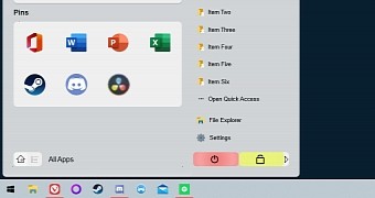
A concept that’s close to going viral envisions a Start menu design that drops one key feature: the live tiles.
The look of this Start menu is cleaner overall and allows for more information to be displayed without eating too much space on the screen. While there are things that could be refined, such as the fonts and the position of some elements, the layout just seems to make more sense, especially in an operating system that’s supposed to help users be productive.
What I don’t like, however, are the colored power buttons and the size of the pinned apps, with the latter being too large and obviously requiring too much space in an otherwise clean design.
Microsoft’s Start menu
But other than that, even if the concept isn’t necessarily perfect, it proposes an approach that Microsoft should at least check out, especially given the feedback after the unveiling of Windows 10X.
Designer for dual-screen and foldable devices, Windows 10X comes with a brand-new Start menu that drops live tiles in the favor of more static icons, again achieving a simplified and cleaner look.
This is something that Microsoft has been looking into for a long time, according to people familiar with the matter. Last year, sources revealed that Microsoft wanted to drop live tiles simply because Windows 10 adopters weren’t using them, instead going for a more static design that gets closer to the one in Windows 10X.
For now, there are no big Start menu changes on the radar, but sooner or later, updates here will undoubtedly be announced. Check out the concept here and let us know in the comment box below if and how Microsoft should improve it for a production version in Windows 10.

 14 DAY TRIAL //