They say Windows 10 is an outdated operating system whose look has barely improved over the years, with many people actually pointing to Apple’s macOS as the best example of how a modern desktop experience should come to be.
On the other hand, Microsoft has put a lot of effort into Fluent Design, the new language that’s overhauling not only Windows, but also other products and the pre-loaded OS apps, and this is how we ended up with acrylic, shadows, and other effects that are now available on the desktop.
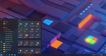
And while people still don’t think Windows 10 is heading in the right direction, a couple of screenshots that someone posted on reddit shows just how cool the OS and the Start menu could end up looking with just small tweaks here and there.
The Start menu that you see here is based on the recent set of refinements that Microsoft announced as part of the Windows Insider program – but which you can also enable on stable Windows 10 with the instructions that you find here.
Improved Start menu
This tuning comes down to theme-aware tiles, which basically give up on the solid colors for backgrounds that match the Windows 10 theme. So technically, if you use a dark mode, the tiles should now align with the OS look more seamlessly, as you can see in the screenshots here.
Needless to say, this isn’t a concept or anything like that, it’s just Windows 10 with modern icons in the Start menu, theme-aware tiles, and a custom wallpaper.
The dark theme, in particular, is the one that looks pretty cool, and sooner or later, this is what everybody should be able to use without any further modifications. The new Start menu refinements could go live as part of the Windows 10 version 20H2 feature update in a few months.

 14 DAY TRIAL //