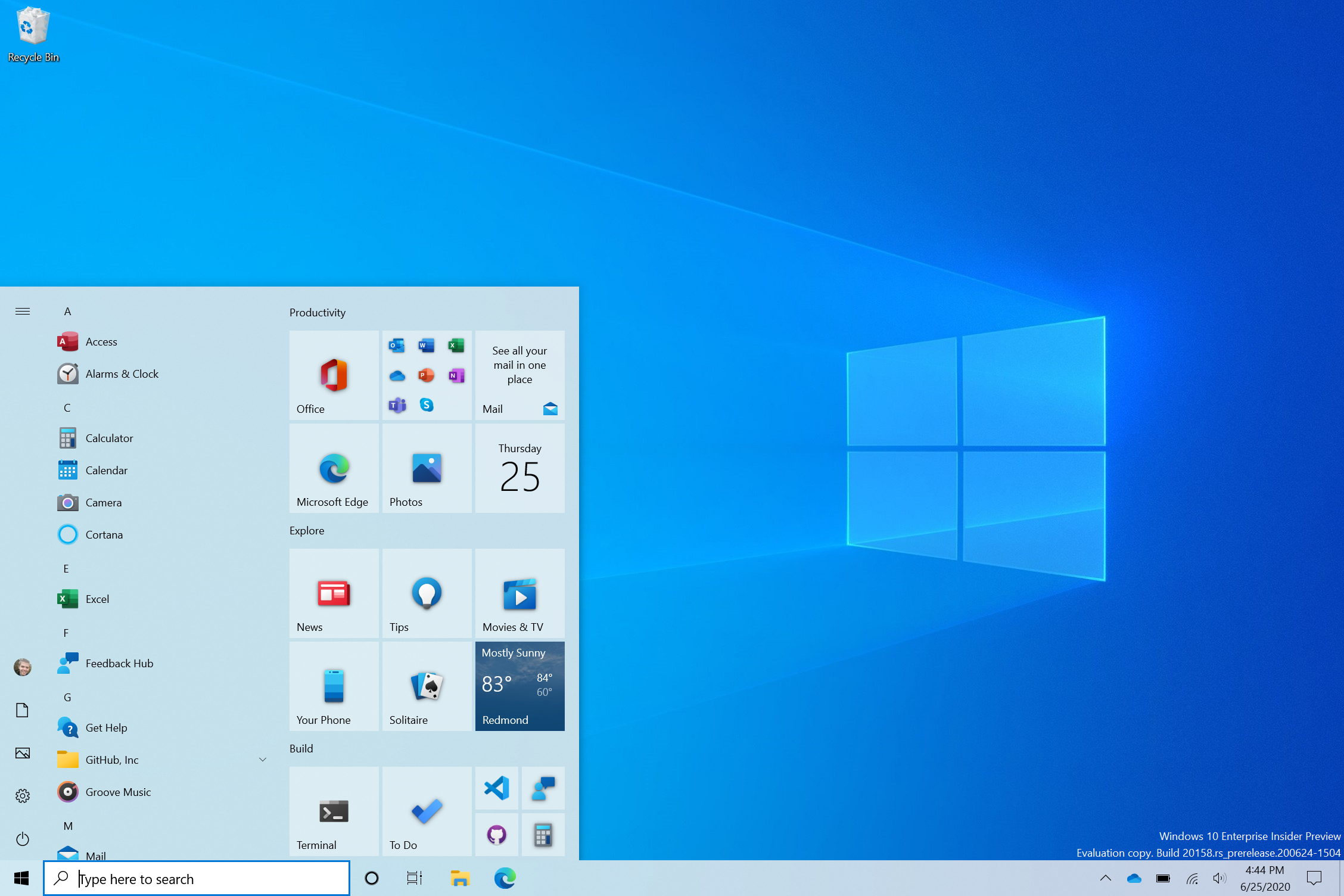
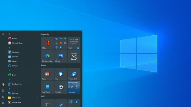
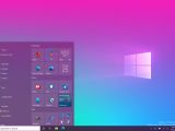
We’ve known for a while that Microsoft was working on further polishing for the Start menu, and the software giant itself rolled out several teasers to provide us with a quick glimpse into how the whole thing would eventually look.
Needless to say, the existing Start menu isn’t necessarily outdated, and it still serves its purpose very well, only that with everything in Windows 10 getting a facelift, people expect this feature to look and feel more modern too.
And this makes total sense.
The Start menu is for many the very first thing they click after booting to the desktop, so it’s the starting point for everything they do on the device. This is actually the reason so many people ended up feeling lost in Windows 8 when Microsoft for some reason thought it was a good idea to remove the Start button and the Start menu.
On the other hand, in Windows 10 the Start menu is definitely here to stay. And what’s more, it’s set to receive additional polishing that’s supposed to go live in the coming months.
The most recent preview build allows users to test-drive a refined look of the Start menu, albeit what’s very important to know is that a release date for production devices isn’t yet confirmed.
In other words, while this new design is being tested, Microsoft has no release date in mind for the time being. The next two feature updates are version 20H2 in the fall of this year and version 21H1 planned for the spring of 2021. The first, however, is expected to be a rather small update with the focus on under-the-hood improvements.
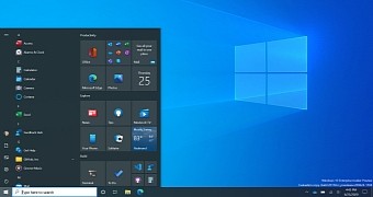
Windows 10 build 20261 introduces the first changes as part of this Start menu overhaul. The company has removed the colored backgrounds and now uses transparency together with icons that are part of the Fluent Design makeover.
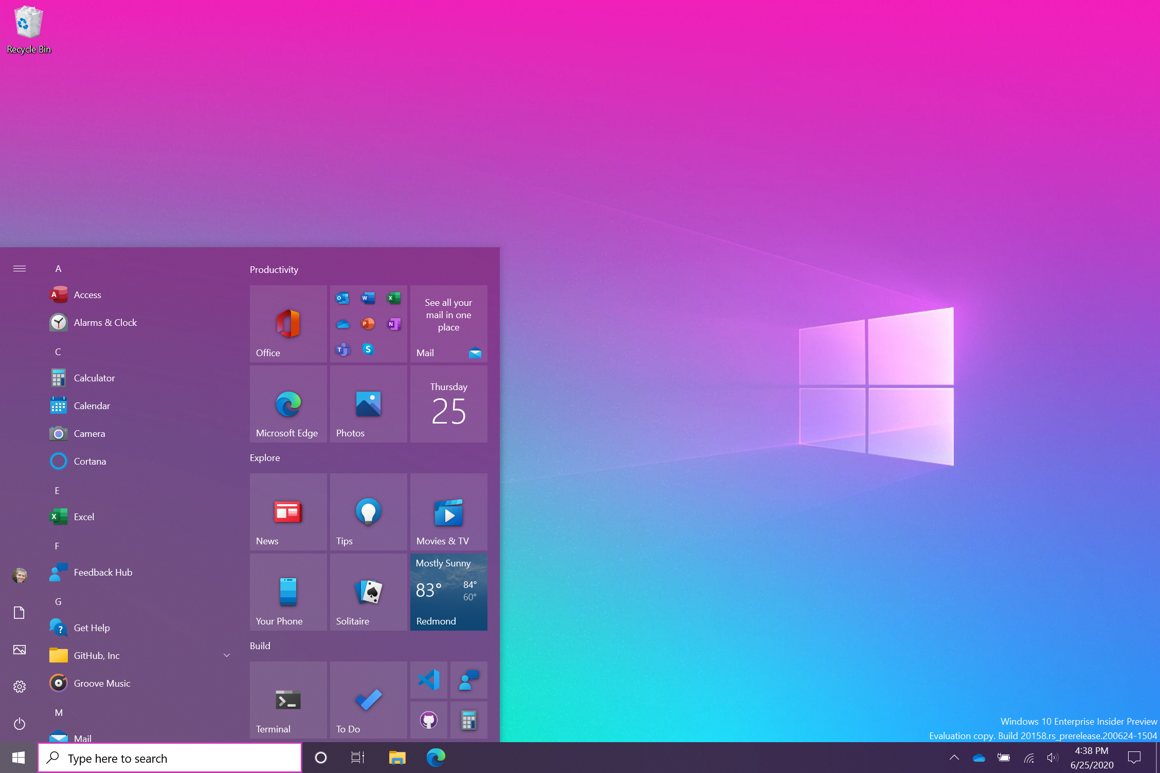
“We are freshening up the Start menu with a more streamlined design that removes the solid color backplates behind the logos in the apps list and applies a uniform, partially transparent background to the tiles. This design creates a beautiful stage for your apps, especially the Fluent Design icons for Office and Microsoft Edge, as well as the redesigned icons for built-in apps like Calculator, Mail, and Calendar that we started rolling out earlier this year,” Microsoft says.
The look of the Start menu overall is significantly improved, as everything indeed looks more modern and aligns with the rest of Windows 10 in the first place.
The icons, for example, seem to blend in to the Start menu more seamlessly, especially in the light theme.
What you need to know, however, is that the live tiles aren’t going anywhere for now. People familiar with the matter recently suggested that Microsoft might be interested in killing off the live tiles from Windows 10, but for now, it’s pretty clear they’re here to stay too. This Start menu makeover keeps live tiles around, albeit without any noticeable changes.
The new overhaul includes both the light and the dark modes, and you can also enable accent colors for a more colorful experience.
Nothing else changes for now, so you’re getting the same layout and sections in the Start menu. This might be disappointing for those who liked the Windows 10X Start menu, but for now, Microsoft doesn’t seem to be very interested in migrating this design to full Windows 10.
Most likely, the Start menu look is expected to be further polished by the time it lands on production devices, albeit I expect this to happen in stages. So you won’t see a major Start menu redesign all of a sudden, but rather get minor retouches every now and then until the facelift is eventually completed.
 14 DAY TRIAL //