14 DAY TRIAL //
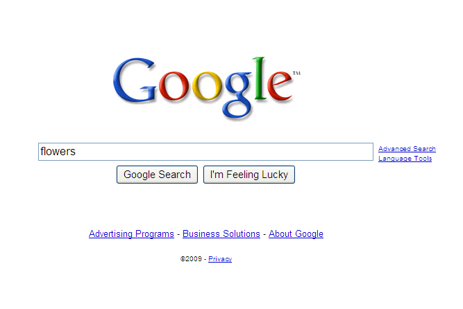
 Google's design is iconic, not the most eye-pleasing perhaps, they're all a bunch of engineers over there after all, but the most effective, clean and memorable. And it doesn't get more iconic than the homepage, which has been more than ten years in the making. So, what's Google to do with a newly patented homepage? Why, change it, of course, and, as the old saying goes, “Bigger is better,” so the search box is now bigger, longer, technically, and, Google says, better.
“[S]tarting today, you'll notice on our homepage and on our search results pages, our search box is growing in size. Although this is a very simple idea and an even simpler change, we're excited about it — because it symbolizes our focus on search and because it makes our clean, minimalist homepage even easier and more fun to use,” Marissa Mayer, Google's vice president for search products and user experience, said. “Google has always been first and foremost about search, and we're committed to building and powering the best search on the web — now available through a supersized search box.”
The changes itself are for the search box on the homepage, but also on the search-result page. The box is significantly longer, but the text size has also increased, making it easier to see your query. The suggestion-box text is also larger, to match the one users type in. One thing that isn't clear is if the longer box also means it can fit longer searches, not that it was much of a problem for most people, or whether the larger text font takes up the new space, so that the same number of characters is pretty much the same.
Google Loves Netbooks
One possible explanation for the change would be just that, it's longer so that longer text can fit in, and it's also supported by the fact that search-engine queries are getting longer over the years. But the average search is still at around three words, hardly enough to challenge the full length. And it's unlikely that Google would change its homepage just for the very small number of people that may have found it cramped.
Another, much more likely explanation, comes from the secondary change. Even though the emphasis is on the longer search bar, the most important modification is the larger text font, which should come in handy on smaller screens with a lower resolution, like those on netbooks. Another clue comes from the screenshot Google provided of the old versus the new homepage. The comparison was made on Windows XP running Google Chrome, a perfect combination for a netbook, most of which can't really run anything newer than XP because of the hardware constrains, while the Chrome minimalistic interface makes the most out of the limited-screen real estate.
With Google planning to get into netbooks with its very own, purpose-built operating system, Chrome OS, and netbooks being the perfect home for its suite of web apps, it doesn't take too much of a stretch of the imagination to say that Google is really interested in the minute mobile computers and that it would modify its homepage to make it easier to use on the small screens.