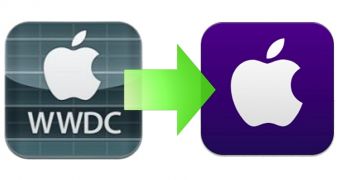
If you’re looking for clues to determine what iOS 7 will look like, look no further than the official WWDC app. Available as a free download from the iTunes App Store, it bears all the graphical elements touted in last week’s leak.
Rumor has it that iOS 7 is “black, white, and flat all over.” A screen is making the rounds supporting this rumor and, knowing that Jony Ive is at the helm commissioning all the aesthetic changes, it’s pretty much a given that iOS will look a lot simpler in its seventh major release.
The official WWDC app seems to have been tailored in exact accordance with the details leaked to 9to5mac last week (here’s our summary of what’s new in iOS 7, in case you’ve missed it).
Since the WWDC 2013 app is the first piece of software developed in line with the iOS 7 redesign, you could say it’s the first glimpse at iOS 7 itself.
From head to toe the WWDC app has been redesigned with flatter graphics, less 3D effects, less color, more focus on the features rather than on visual appeal (not that it’s ugly), and let’s not forget about that glorious purple icon which ditches all that artificial glare.

 14 DAY TRIAL //